Do you watch movies and drama series on HBO? SO DO WE!
Who doesn’t work all week long, patiently waiting for weekends only to binge-watch their favorite movies or seasons on HBO?
Have you ever watched a movie and your eyes happened to notice the HBO logo design on the upper left corner of your screen? We bet you have!
That’s exactly what we are going to focus on in this blog. We are going to see how HBO logo design has evolved over the years and what history it carries behind its finest design at the moment.
HBO Logo Design History and Evolution
The first HBO logo, designed in 1975, was ornamental yet basic. It made us think of a fun and inviting home theatre that shouts “Home Box Office.” The initials of Home Box Office were printed in a chunky black typeface, with the letters O and B slightly overlapping.
The HBO monogram logo is made out of an uppercase strong sans serif typeface that appears to be a heavily altered version of Avant-Garde Gothic. The black and white color palette of the logo has never been altered.
It is the United States’ oldest premium television network. Despite all of the difficulties, the organization has managed to develop a loyal consumer base. One of the reasons for HBO’s success is its iconic logo, which hasn’t changed since 1980.
The design of the HBO logo is quite consistent—it has stayed ageless for over half a century. The major focus is on the brand name, which is drawn in a unique yet minimalistic way.
Black symbolizes independence, control, and sophistication, implying that HBO material is serious and that the HBO streaming service should also be considered seriously. White, on the other hand, adds contrast and gives a clean foundation for the HBO logo. It is a symbol of purity, efficiency, and refinement.
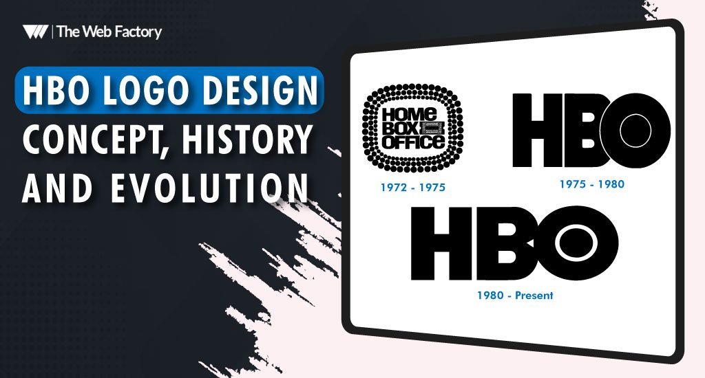
The American television network HBO’s logo has changed thrice throughout its existence, reflecting the company’s shifting position among its competitors. The HBO logo history, although short, has been tremendous.
1972 — 1975
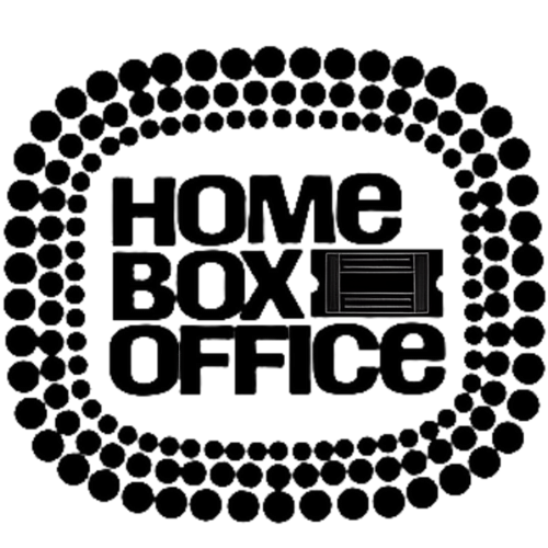
The early HBO logo, which was used for the first five years of the company’s existence, was based on the company’s complete name. Inside a rectangular form made by a stylized image of an illuminated marque, the words “Home Box Office” were placed. A ticket stub was placed next to the term “Box.”

The firm characterized itself with a static picture of its original symbol, a ticket stub ringed by a low-key marquee light pattern, as well as the complete name of the channel—Home Box Office.
1975 — 1980
Bemis Balkind created a fresh version of the logo as early as 1975. Since 1975, the HBO logo has virtually been the same, with a simple logotype featuring an “O” surrounded by a circle, like a camera lens.
These design components should remind the observer of an old-school sign announcing a coming soon or currently playing movie experience. It looks to be too cluttered and difficult to look at since it is the only HBO logo with these design characteristics. It would be tough to remember and recall this logo because it has so many minor parts.

The “O” overlapped the “B” in the 1975 edition, unlike the previous one. It used the acronym “HBO,” implying that the network had already achieved widespread recognition and didn’t need to use the full name to be recognized. The “O” of the logo was carved out of the “B.”
This emblem is significantly more appealing to the eye than the one used from 1972 to 1975. It will be a lot easy to remember as well. The camera lens in this logo has a unique design feature that indicates it is shooting the “B” or that the “B” is recording the viewer. In any case, it indicates that filming is taking place.
1980s: A Daring New Perspective
HBO realized it needed a more dynamic logo to go along with its growing slate of content as it grew in popularity in the 1980s. HBO debuted a new logo in 1983. It had the letters “HBO” in a more styled font with rounded corners and a bolder appearance. The letters were somewhat elevated in this version, giving the impression that they were three-dimensional, which was a little but effective addition.
HBO launched its original programming, which included innovative TV shows and movies, at the same time as the new logo. The channel’s evolution and goal of providing quality content were both reflected in the design. It became a familiar representation of the top-notch entertainment HBO was renowned for.
The Nineties: Polishing and Acknowledgment
The HBO logo underwent a phase of refinement during the 1990s. Another change was made to the design in 1991. This iteration prioritized a sleeker, contemporary design. The font selection was sharper and the letters were now all capital, reflecting the shifting preferences of the television viewership. The color palette of the logo was extended to incorporate vivid shades, making it stand out even more.
With shows like The Sopranos and Sex and the City, HBO cemented its position as a pioneer in original content during this decade. The logo was frequently used in advertising and other promotional materials, and it grew to be associated with high-end television. Its elegant appearance enhanced HBO’s dedication to superior storytelling and contributed to the development of a strong brand identity.
2000s: A Digital Transition
HBO was beset with obstacles as the new millennium drew near, including a rapidly evolving media landscape. The way that audiences consumed content started to change with the advent of digital technologies and the internet. HBO revised their logo once more in 2001 in reaction.
A more understated approach was added in this version. Now, the “HBO” letters stood out against any background because they were housed in a plain black box. The new design prioritized memorability and instant recognition, following the emerging trend of simple branding. More adaptability was also made possible by the box format, which was simple to use with a variety of digital and promotional platforms.
HBO had a turning point in the 2000s when it kept releasing highly regarded shows like True Blood and The Wire. The updated logo reflected the network’s development and further cemented its position as a leader in original content.
The 2010s: Accepting Transition
HBO’s distribution and programming strategy saw substantial adjustments in the 2010s as streaming services took off and completely changed the media landscape. When HBO introduced HBO Now, a stand-alone streaming service, in 2015, the logo underwent yet another change to fit this new medium.
The iconic “HBO” typography on the logo was kept, but it was given a more modern, colorful appearance. Shades of blue were added to the color scheme to further reflect the network’s branding on different platforms. The logo was simple to modify for digital and television media thanks to its bold font and simple lines.
HBO was creating ground-breaking shows like Westworld and Game of Thrones during this time. The emblem came to represent superior narrative and state-of-the-art production qualities, further cementing HBO’s standing in popular culture.
2020s: Brand Relaunch and a New Era
As the 2020s wore on, HBO had to contend with more competition from massive streaming services. With the 2020 debut of HBO Max, the network fundamentally changed its approach to content delivery. The HBO logo was updated to better represent the goals of the new streaming service in conjunction with its introduction.
The prominent “HBO” font was kept in the new design, but it placed more of an emphasis on a cleaner appearance. The introduction of the “Max” denoted a wider variety of content and viewer accessibility. To convey HBO’s dedication to changing with the times while adhering to its heritage, this rebranding was essential.
The modified logo helped to close the gap between on-demand streaming material and traditional cable viewing. Because of its adaptability, it was able to preserve the integrity and familiarity of the brand while adjusting to other platforms.
The Idea Behind HBO’s Logo Design
The way the HBO logo has changed over time is evidence of the network’s flexibility and dedication to excellence. Every redesign takes into account more general developments in technology, design, and audience tastes. The logo, which represents HBO’s commitment to providing top-notch entertainment, has always strived for recognition and clarity.
The simplicity of the HBO logo is a fundamental design element. The sans-serif font is bold and easy to read, making it identifiable in a variety of media formats. This minimalism supports HBO’s core value of storytelling by letting the content take center stage.
Versatility is another crucial element. The strength of the logo’s design is demonstrated by how well it adjusts to various backdrops, like the bright UI of a streaming app and the dark screen of a television. This adaptability has been essential to preserving brand coherence as the network’s reach has grown to include other platforms.
In conclusion, A Logo That Conveys a Narrative
The HBO logo will keep changing in the future, according to new audiences’ demands and technological advancements, while continuing to stand for excellence and creativity. Its journey serves as a reminder that great design is about connection, identity, and storytelling in addition to beauty. The HBO logo is more than simply a graphic symbol; it’s a symbol of superior entertainment that draws viewers into a world of gripping stories and life-changing events.


