The iconic American soft drink brand Pepsi’s logo design and concept are just as distinguished as the unique taste of this celebrated drink.
Intriguingly, the renowned brand’s logo has undergone several changes and has evolved since its first design to the current one, which the world has come to recognize and love. The complete shift in the concept and design since 1898 has given the brand a new feel over time.
Pepsi’s three-part logo was redesigned in 2008. The top half is red, and the bottom half is blue, with a curvy white line running through the center of the globe.
Some believe it represents the American flag, while others claim that their renewed logo represents the earth’s magnetic field, Chinese geomancy, Pythagoras, the dynamics of the earth, and the Renaissance.
The logo is designed to highlight Pepsi’s oscillatory motion and the “gravitational pull” of a can on a supermarket shelf. It is intended to run parallel to the universe’s rate of expansion.
Who Designed the Pepsi Logo?
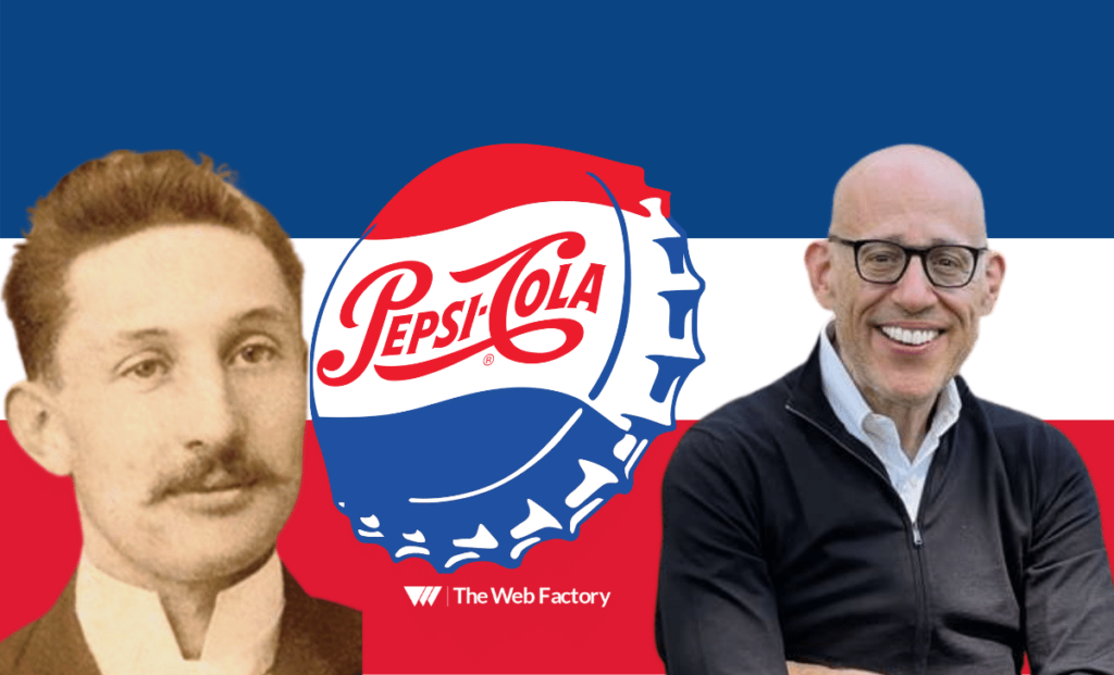
Caleb Bradham, the brand’s creator, came up with the first script logo (or cursive logo design) for Pepsi in the 1903’s. The highly recognized Pepsi Globe dates back to the 1940s, but it wasn’t until 2008–2009 that designers from Arnell Group gave it its current appearance.
Pepsi Logo Color and Font
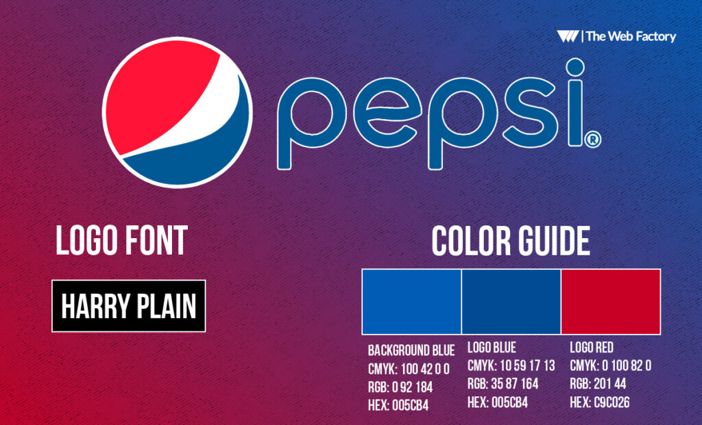
Red and blue are Pepsi’s appointed colors. The colors of the Pepsi logo stand for vigor and enthusiasm. Since 2014, the Pepsi color scheme has remained constant. The Pepsi color palette can be used for various design tasks and initiatives. The Pepsi font is a well-known sans-serif typeface used for the title of the Pepsi logo. Jakub Degorski designed the official Pepsi logo font.
What is Pepsi’s Slogan?
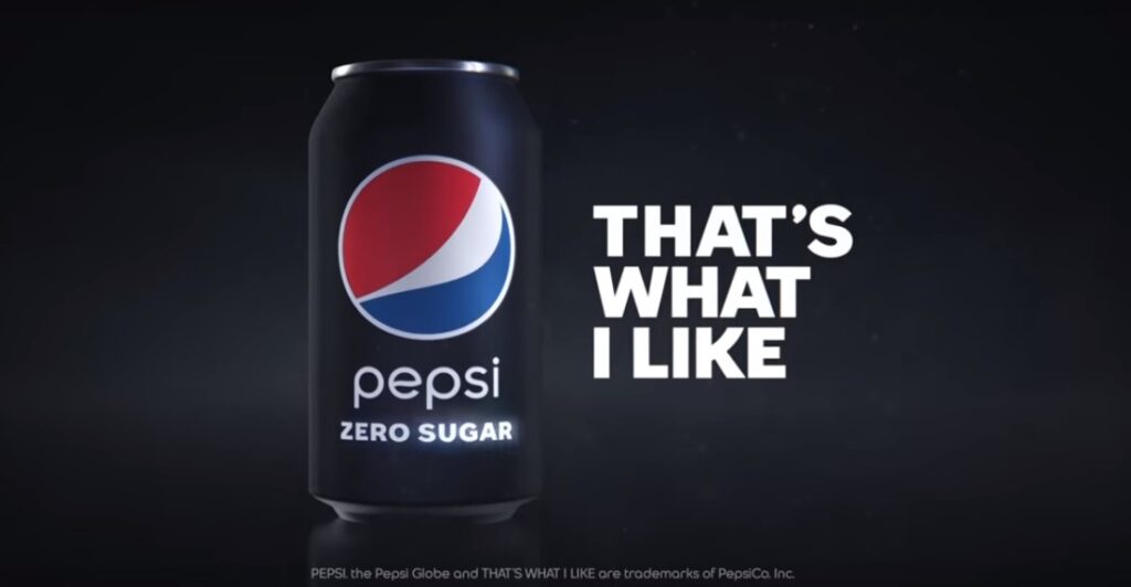
Pepsi started using its new slogan in the United States, “That’s What I Like,” for its Pepsi, Pepsi Zero Sugar, and Diet Pepsi products. According to the corporation, the phrase will endure permanently, and it is the first change to the brand’s tagline in more than 20 years. Pepsi feels that the phrase captures the devotion of devoted Pepsi drinkers. Todd Kaplan, vice president of marketing for the company, planned to use a series of video advertisements to introduce the catchphrase. Kaplan wanted the campaign to be “music forward.”
After conducting comprehensive market research on Pepsi’s customers, the brand discovered that it wants its audience to “enjoy life to the fullest.” This led the firm to choose the new tagline.
The brand was hopeful that the phrase would convey this impression to soda drinkers. According to a Gartner analysis, Pepsi now thrives on social media, garnering some of the highest fan engagement among beverage companies on Facebook.
Although the brand is successful on social media, Pepsi focuses more on television advertising for its new tagline. Five commercials featuring various individuals becoming “lost in the moment” have been aired nationally for the company.
Each commercial has a distinct, lively musical style, such as dance hall and Latin pop, to reflect the variety of Pepsi drinkers.
Pepsi hosted the well-known halftime show in 2020 to promote the Super Bowl. The business also collaborated with the NFL to launch the commercials during NFL Wild Card games.
A Brief History of Pepsi
The soda was originally made in 1893 by Caleb Bradham to sell in his drug store. The “Brad’s Drink” concoction was prepared using water, sugar, caramel, nutmeg, lemon oil, and cola nuts.
Bradham renamed Pepsi in 1889 to market it as a healthy drink. He named it after pepsin, the enzyme that helps with indigestion. The drink was initially brewed to provide similar benefits as Coca-Cola, which originated in 1886. It wasn’t until 100 years later that the two industry giants came to serious head-to-head competition.

Pepsi itself is estimated to be worth over $11 billion. The immensely diversified range of food and beverage brands brought about a net revenue of over $70 billion in 2020.
The brand’s current product collection has over 23 brands, generating more than $1 billion in annual sales. The popular brand’s snacks, beverages, and other products are sold in over 200 countries as fast-moving consumer goods.
The Evolution of the Pepsi Logo Design: The Timeline
To set itself apart from competitors, the Pepsi logo has had pretty rigorous changes with time from what was initially created. The emblem style also changed to keep up with the times and to engage in a more trendy and classic look.
1893 till 1898
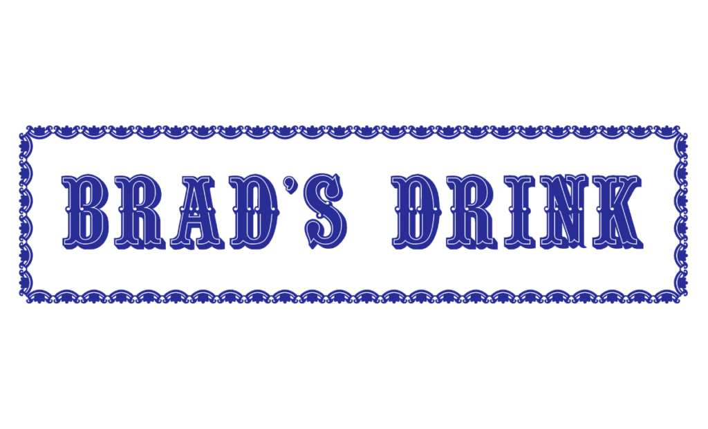
The American businessman Caleb Bradshaw, who ran a drugstore in North Carolina, is credited with creating the fabled beverage. Pepsin, a digestive enzyme, and cola nuts were the drink’s two main ingredients, and it was designed to aid morphine addicts. The letters of the logo were blue serif. Its capital letters have smooth curves and a beautiful old-fashioned look. The wordmark had a white background and a slim, decorative rectangular frame around it.
1898 till 1905
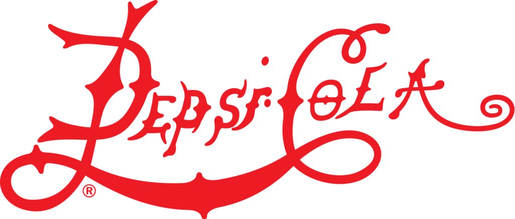
The soda’s name was changed to Pepsi-Cola to better represent its components. Additionally, a new logo was created to reflect the new brand. The product’s primary and exclusive visual identity component was now the red cursive script with extended and curved lines.
1905 till 1906
In 1905, the logo underwent yet another revision and began to resemble Coca-Cola’s casual identification, the brand’s major rival. It had large, red script lettering with a long, curved tail for the letter “C” and connecting lines for the letters “P” and “C” that highlighted the entire logotype and produced a double loop pattern.

1906 till 1940
The thin, delicate “Drink” lettering was put on the upper line of the letter “C” in 1906, refining the red writing. Compared to the other iterations, this logo had broader lines and appeared more assured and substantial. It was positioned somewhat diagonally, which added a sensation of motion and advancement with the years.

1940 till 1962
The 1940 update gave the logotype a more upscale and contemporary appearance. The writing was bolder and thinner after all the excess lines were cut off. This was the final iteration with the straightforward red-and-white color scheme. In 1950, the first iteration of the Pepsi logo was released. The red script lettering from the earlier version was positioned on the white portion of the metal bottle cap in the image, which was colored red, white, and blue.
The company resumed using the logo in 2014, which is still present on items today, albeit only on the back of the product.

1962 till 1973
The three-colored cap carried on the primary visual identity motif from 1962. It served as a backdrop for a black, bold “Pepsi” inscription in all capital letters using a straightforward sans-serif typeface with an altered letter “S.”

1973 till 1987
The company’s visual identity was created in 1973, making it more contemporary. The rectangle in a white frame contained the circular with a distinct white outline. The right side of the rectangle was blue, while the left was red. The circle’s white portion featured a prominent blue nameplate and the bottle cap design from the preceding logos.

1987 till 1991
1987 the logo’s white frame was dropped, and the typography was made larger. Along with the typeface update, the letter “E” had rounded corners and was a more overall smooth design.

1991 till 1997
In 1991, the nameplate was positioned outside the circle. The inscription was included with a red rectangle positioned horizontally beneath it and a blue and red circle with a thick white curve in the middle on the right side of the rectangle. A second logo, using white writing on a blue background with two different hues to form a geometric pattern, was created in 1996. A portion of a sphere was positioned in the bottom right corner of the logo in place of the signature circle.

1997 till 2003
In 1997, the infamous soda’s visual identity was simplified: a faint blue outline and shadow around the white wordmark, written in a strong sans-serif font with straight lines and slightly italicized letters.

2003 till 2006
In 2003, the writing was given a new, more dynamic shape, and the emblem’s colors were rendered in gradients to give it a glossy, vibrant appearance. Even though the business has only used this logo for three years, it is still present on some products in selected international markets.

2006 till 2008
In 2006, the typography was positioned beneath the Pepsi symbol. The logo was created with clearer lines and had a texture of water drops, increasing volume and making it look realistic. It was colored blue and had a thick white outline.

2008 till 2014
2008 saw the creation of Pepsi’s entirely new logo. The inscription was written in lowercase letters, and the emblem was rendered in two dimensions.
Current Pepsi Logo
The 1940 update gave the logotype a more upscale and contemporary appearance. After all the excess lines were cut off, the writing was bolder and thinner. This was the final iteration with the straightforward red-and-white color scheme.
The company resumed using the logo in 2014, which is still present on items today, albeit only on the reverse.
The most recent iteration of the brand’s emblem, created in 2014, is among the most understated in its history. The logo positioned to the left of the wordmark no longer has a frame and appears contemporary and reliable. The writing is still in lowercase, and the “E” in the distinctive sans-serif style is designed to evoke a white wave from the symbol.

The current Pepsi logo, sometimes known as the Pepsi Globe, has a smile-like appearance. A white swirl inside a sphere-like form separates it into blue and red sections. The Arnell Group reportedly earned $1,000,000 to rebuild the website in 2008.
Pepsi established itself in the market as the drink of the upcoming generation of energetic youth by promoting itself as the brand of modern stars of the day, such as Michael Jackson, Britney Spears, and Shakira.
With a minimalist design element, Pepsi’s branding is supreme for modern platforms and packaging. It’s easy to read and represents the brand’s elements most comprehensively.
Pepsi’s Logo Design: A Penny For Your Thoughts
The understanding we derive from the Pepsi logo design and its changes over the years is to continually maintain a flow without visualizing and incorporating past concept(s) to keep up with current logo design trends.
The will to make changes taking risks can reap attractive benefits, just like how Pepsi did, making substantial changes in the initial 50 years of its existence.
Nevertheless, Pepsi’s winning formula switches were made using variations of a common theme, with the logos not being that different from the ones we see today from a professional logo design service.
This gives consumers a feeling of continuity as the logo dates back to history, taking the built-in trust to the good old days and bringing back nostalgic memories.
However, many companies cannot follow the same practice with their products and services. Their focus may change with time, making the company reconsider its marketing strategies and implement new ones.[/vc_column_text][/vc_column][/vc_row]

