25 Stunning Interactive Website Examples & Design Trends (2025)


0:00
/
0:00


25 Stunning Interactive Website Examples & Design Trends (2025)


12 Best Web Design Companies in 2025 – Top Agencies

How to Build Engaging, High-Performing Web Experiences

Here’s the thing—
A website design agency knows you can’t afford to be forgettable on the internet anymore.

Static websites? They’re digital brochures.
But interactive websites? They pull people in. They move. They respond. They tell stories.

Whether you’re a brand, agency, creative, or ecommerce startup—if your website isn’t doing something, your audience is doing nothing.

So in this blog, we’re going deep.

You’ll get:

  • 25 real interactive website examples—and what they did right
  • A breakdown of what makes interactive websites work (and convert)
  • A clear answer to: How do I create one? What’s worth investing in?
  • Plus, answers to the questions everyone’s googling—like cost, timeline, design types, and more

Let’s dive into the sites that move people—and the thinking behind them.

What Is an Interactive Website?

An interactive website isn’t just something you scroll through. It’s something you engage with. It reacts, responds, adapts. It’s built to pull you in—through clicks, hovers, animations, quizzes, custom journeys, or even gamified elements.

Think of it like this:

  • A static website tells you something.
  • An interactive website shows you, involves you, and makes you feel something.

It’s about creating a two-way experience. A conversation, not a monologue. And when done right? It can drastically improve how long users stay, how much they explore—and yes, how likely they are to convert.

Side-by-side view of a generic template site vs. a sleek animated homepage with layered scroll effects.

25 Best Interactive Website Examples (That Actually Work)

We’re not here to show you “pretty” websites. We’re here to show you interactive websites that perform—ones that turn passive viewers into active participants.

Below, we’ve curated 25 standout sites, broken down by type. For each one, we’re not just saying what it looks like—we’re breaking down why it works.

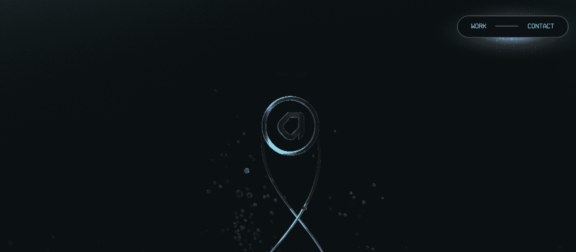
1. Locomotive (Creative Studio)

Website: https://locomotive.ca 

What You See:

A sharp, fluid scroll experience with layers of motion. Cursor-reactive effects, dynamic typography, parallax visuals — everything feels alive.

What’s Happening?

  • Scroll-Jacking Done Right: They control the pace, not to restrict you, but to guide you—like a director pacing a film.
  • Motion Hierarchy: Not every element moves the same. Background shifts slightly. Foreground glides faster. CTAs pop subtly. Your eye follows a precise path.
  • Typography as Experience: The type isn’t just readable—it moves, scales, and anchors your attention.

Why It Works?

They don’t tell you they’re cutting-edge. They let you feel it. The site doesn’t need to say “we’re good at digital design”—you know by the way it behaves. The medium is the message.

Takeaway:

If you’re a designer or creative agency, your site is your pitch deck. Locomotive proves you don’t need walls of text—just precision, emotion, and flow.

2. Active Theory (Immersive Studio)

Website:https://activetheory.net 

What You See:

A gamified, almost alien-feeling 3D environment. You don’t scroll down—you navigate through. Think interactive web universe.

What’s Happening?

  • WebGL + Real-Time Rendered Worlds: Their homepage is more engine than website. It’s rendered like a game—controlled via cursor, scroll, and drag.
  • Minimal Interface, Maximum Discovery: No cluttered menus. Instead, interaction becomes navigation.
  • Subtle Feedback Loops: Elements light up, shift, or respond as you hover—training you how to use the site without explaining anything.

Why It Works?

Active Theory doesn’t just showcase their skills—they create a digital environment that feels like the future. You don’t read about what they do—you live it.

Takeaway:

Want to be perceived as high-tech and immersive? Don’t explain. Build an experience where users lose track of time. Make them play. Make them explore.

3. Daniel Spatzek (Designer & Developer)

Website: https://www.spatzek.com 

What You See:

A bold, horizontal-scrolling portfolio that breaks every grid rule—but still feels intuitive and smooth.

What’s Happening?

  • Controlled Chaos: The layout feels wild—glitch effects, massive headers, overlays—but it’s all scripted tightly. Animations are timed and lightweight, never lagging.
  • Personal Narrative, Abstracted: Instead of “About Me” or bullet points, you get movement, vibe, and tone. His personality is coded into the design.
  • Magnetic Hovers + Cursor Play: The cursor becomes a tool—magnifying, pulling, stretching elements as you explore.

Why It Works?

It doesn’t try to fit into anyone else’s mold. It feels like Daniel. You remember it. You feel like you know him—before you even get to the contact form.

Takeaway:

A personal brand should reflect your personality. If you’re experimental, your site should look and feel like an experiment. Don’t chase trends—build a signature.

4. Obys Agency (Design Studio)

Website: https://obys.agency 

What You See:

Bold, brutalist layouts with minimalist color palettes. Unexpected scroll directions, type that shifts with motion, and sharp page transitions.

What’s Happening?

  • Horizontal + Vertical Scroll Hybrid: They use layered scroll techniques to build narrative pacing—horizontal for portfolio storytelling, vertical for brand sections.
  • Asymmetry with Intent: Layouts feel rebellious but never messy. Each break from the norm is calculated, serving a design or emotional purpose.
  • Sound-Enhanced UX: They integrate subtle sound cues, making the interaction feel even more immersive—something many overlook.

Why It Works?

Obys isn’t just showing off their work—they’re using the site as the medium. It’s a living example of their artistic courage and UX mastery.

Takeaway:

Structure doesn’t mean safe. If you’re bold and you know what you’re doing, break the rules—but do it with control.

5. Resn (Creative Studio)

Website: https://resn.co.nz 

What You See:

A surreal, interactive journey into a virtual universe. Think floating elements, weird sounds, alien interfaces, and unpredictable navigation.

What’s Happening?

  • WebGL-Laced Environment: The entire site is a surrealist, programmable playground. You experience their creative power without reading a word.
  • Unconventional CTA Flow: There’s no straight funnel. They lead with curiosity and let your interaction drive the journey.
  • Immersive Branding: Resn has a vibe—odd, futuristic, eccentric—and every pixel reinforces that brand tone.

Why It Works?

Most agencies sell you on process. Resn sells you on wonder. You don’t use the site—you fall into it.

Takeaway:

If your audience is creative, entertain them first. Engagement doesn’t come from structure—it comes from surprise.

Laptop showing interactive website wireframes and a live editor with glowing animated elements.

6. NOMINT (Animation Studio)

Website: https://nomint.com 

What You See:

A clean, almost editorial layout with highly dynamic video previews, seamless scroll reveals, and smooth transitions.

What’s Happening?

  • Video as the Hero: They use high-quality reels and motion graphics in place of static thumbnails—everything’s in motion before you even click.
  • Narrative Portfolio Flow: Each project case study opens with a punch—cinematic intros, storytelling, and full-screen motion.
  • Simple Interface, Deep Storytelling: The UI is minimal, but once you dive into a project, it’s rich with detail, process, and context.

Why It Works?

They let their work do the talking—and they give it a cinematic stage. It’s professional, emotional, and crystal-clear.

Takeaway:

If you do motion or video, don’t hide it behind stills. Let your homepage move. Your site should feel like a trailer, not a PDF.

7. Bruno Simon (3D Developer Portfolio)

Website: https://bruno-simon.com 

What You See:

A miniature 3D driving game where you navigate through Bruno’s portfolio in a virtual jeep.

What’s Happening?

  • Real-Time 3D via WebGL + Three.js: The entire experience is a gamified portfolio with physics-based navigation.
  • Play Before You Learn: You engage with the brand before you see any work. Movement is the interface.
  • Easter Eggs + Interactivity: From tire tracks to interactive elements, it rewards curiosity.

Why It Works?

This isn’t just showing tech skills—it is the tech skills. The experience is proof of capability.

Takeaway:

If you’re a developer, stop saying what you can build. Integrate the proof directly into the website.

8. Gucci Beauty (E-Commerce / Brand)

Website: https://guccibeauty.com 

What You See:

An art-gallery-style shopping experience—rich visuals, abstract layouts, slow-motion videos, editorial photography.

What’s Happening?

  • Magazine-Like Navigation: Feels more like flipping through Vogue than browsing a product grid.
  • Art Direction-First UX: Every product is part of a stylized visual story, with scroll animations creating mood, not just movement.
  • Hybrid Layouts: Modular sections with layered scroll animations to create dynamic storytelling.

Why It Works?

Luxury doesn’t need to scream “Buy now.” Gucci makes the brand feel like high art—and sells through vibe, not pressure.

Takeaway:

For premium brands, storytelling sells more than urgency. Show the world where your product lives, not just the product.

9. Species in Pieces (Educational / Awareness)

Website: http://www.species-in-pieces.com 

What You See:

A powerful interactive art piece where endangered species are displayed as morphing geometric fragments.

What’s Happening?

  • CSS-Based Animation: Pure HTML/CSS with no external plugins—just code turning into emotion.
  • Educational Depth: Click each species to get detailed info, conservation data, and visuals—all tied to an artistic theme.
  • Minimalist but Impactful UX: Clean background, sharp typography, and timed interactions put the message front and center.

Why It Works?

It proves that web design can be art and activism at the same time—and all without using JavaScript.

Takeaway:

Don’t overengineer. If the message is powerful, let design amplify it—not drown it.

10. Moxy Studio (Creative Agency Website)

Website: https://moxy.studio 

What You See:

A hyper-fluid scroll experience with smooth motion, bold typography, and playful transitions that feel alive.

What’s Happening?

  • Scroll-triggered Layers: Content reveals are stacked and animated with parallax and layered transitions.
  • Dynamic Case Studies: Project showcases pop with motion-based hover states and detailed, expandable views.
  • Tone & Vibe: Everything feels deliberately chaotic—in a “this-agency-knows-what-it s-doing kind of way.

Why It Works?

They walk the talk. Everything from structure to flow communicates creativity without ever saying the word.

Takeaway:

When your brand is “creative,” your site should behave creatively. No static layouts. No boring grid. Just pure motion.

Scroll-telling website with cinematic transitions and animated storytelling visuals.

11. Nomadic Tribe (Interactive Storytelling)

Website: https://nomadictribe.com 

What You See:

A cinematic digital journey following a fictional tribe across animated landscapes with scroll-based storytelling.

What’s Happening?

  • Full-Screen Scroll Storytelling: Each scroll step changes the scene, like frames in a movie.
  • Music + Motion Sync: Background soundtracks shift as you scroll, pulling you into the atmosphere.
  • Layered World-Building: Environment changes, characters evolve, and the storyline adapts as you move.

Why It Works:

It’s not just a site—it’s an experience. Users become part of the journey, and that creates an emotional connection.

Takeaway:

Use storytelling mechanics. If you want people to stay, give them a reason to keep exploring.

12. Inside Abbey Road (Educational / Interactive Tour)

Website: https://insideabbeyroad.withgoogle.com 

What You See:

A virtual walkthrough of the iconic Abbey Road Studios powered by interactive hotspots and multimedia.

What’s Happening?

  • 360° Navigation: Users can explore every room, view historic details, and interact with mixing boards.
  • Multimedia Layering: Embedded video clips, audio snippets, and tooltips give historical context in real time.
  • Timeline Anchoring: You’re not just clicking around—you’re following a guided, immersive narrative.

Why It Works?

It’s educational without being boring. It turns information into a game—and that’s why it sticks.

Takeaway:

When your content is deep, don’t just present it—build a world around it.

13. Bruno Simon (3D Portfolio Website)

Website: https://bruno-simon.com 

What You See:

A portfolio turned into a 3D driving game—literally. You’re behind the wheel of a toy truck navigating his work, bio, and contact info.

What’s Happening?

  • WebGL + Three.js Power: Full 3D rendered environment built entirely in the browser.
  • Physics-Based Interaction: The truck responds to clicks, gravity, and momentum in real time.
  • Play-to-Explore Navigation: Users “drive” to different sections instead of clicking.

Why It Works?

Bruno’s work is creative dev—and the site is a bold, confident proof of concept. No need for testimonials when the site is the pitch.

Takeaway:

If your work is technical or niche, turn your website into a living demo.

14. The Cool Club (Interactive Product Website)

Website: https://www.thecoolclub.co 

What You See:

A quirky, animated interface showcasing card decks featuring famous figures from music, art, science, and politics.

What’s Happening?

  • Card-Based UI with Dynamic Sorting: Users can shuffle, flip, filter, and interact with characters in real time.
  • Subtle Micro-Animations: Icons wiggle, cards dance, hover states surprise.
  • Narrative Browsing: You don’t just “shop”—you explore, discover, and collect.

Why It Works?

They turned e-commerce into a playground. It keeps users engaged longer and increases product curiosity.

Takeaway:

Don’t just “display” your products. Let users play with them—even digitally.

15. Awwwards (Web Design Gallery / Voting Platform)

Website: https://www.awwwards.com 

What You See:

An endless scroll of elite web designs—updated daily—with community-driven scoring and insights.

What’s Happening:

  • Real-Time Voting: Users rate UX, UI, creativity, and content. Rankings shift dynamically.
  • Interactive Filters: You can search by color, industry, format, and interaction level.
  • Embedded Previews: Sites load within the page, so you never leave the platform.

Why It Works:

Awwwards doesn’t just talk about great design—they showcase it, dissect it, and crowdsource feedback. Designers stay glued.

Takeaway:

If your niche loves comparison, turn your site into a platform—don’t just be the expert. Host the conversation.

Minimalist abstract website design with glowing UI components reacting to scroll and hover.

16. Species in Pieces (Educational / Interactive Art)

Website: http://species-in-pieces.com 

What You See:

A beautifully abstract digital exhibition featuring 30 endangered species—each built from 30 triangular fragments that animate into life.

What’s Happening?

  • SVG + CSS Animation: Each species morphs into the next using vector shapes, no videos or 3D.
  • Data-Driven Storytelling: With each transition, detailed conversation info slides in.
  • Scroll-Triggered Exploration: You guide the pace. Pause, reflect, skip, repeat—your call.

Why It Works?

This isn’t just design—it’s digital activism. Art meets science meets web. The visuals are memorable, but the message hits deeper.

Takeaway:

Interactive design can educate emotionally. Shape narratives that move, not just inform.

17. Webflow (Product Website + Experience Playground)

Website: https://webflow.com 

What You See:

A slick SaaS site with lightning-fast load times, modular sections, and case studies that feel cinematic.

What’s Happening:

  • Live Product Demos Embedded in Page: You can try Webflow’s features without signing up.
  • Scroll-Based Motion & Transitions: Headers morph, CTAs slide, interfaces come alive as you scroll.
  • Context-Aware Interactions: Pop-ups, tutorials, or callouts change depending on how you engage.

Why It Works:

Webflow sells interactivity—so their site is interactive by default. But it’s also educational, showing you what’s possible with their platform.

Takeaway:

If your product is powerful, let users experience it right away—don’t make them guess or scroll forever.

18. CLM BBDO – Casseurs Flowters (Entertainment / Music Promotion)

 [Archived version available online]

What You See:

A virtual apartment tied to a rap duo’s concept album—you “walk” through their life and explore songs tied to specific rooms.

What’s Happening:

  • Narrative + UX Fusion: Every interaction moves the music video and story forward.
  • Environmental Interaction: Clicking objects triggers audio, lyrics, or backstory.
  • Time-Based Unlocks: Some rooms only open after exploring others, building mystery.

Why It Works:

This is storytelling on steroids. You don’t just listen to the music—you live it. It’s immersive brand building at its finest.

Takeaway:

Fuse product and environment. Build a world, not just a webpage.

19. Bruno Simon Portfolio (3D Developer Portfolio)

Website: https://bruno-simon.com 

What You See:

You drive a tiny 3D car around his portfolio—a fully explorable world where each section is a location.

What’s Happening:

  • Three.js 3D engine: The entire site is rendered like a game.
  • Physics engine + gamified UI: You crash, bounce, and navigate like it’s a sandbox.
  • Minimal text, max engagement: Everything is visual, reactive, and interactive.

Why It Works:

It’s unforgettable. You don’t just view the portfolio—you experience it. It perfectly reflects his technical and creative skills.

Takeaway:

When your audience is developers or creatives—go bold. Let your work speak through the experience itself.

20. Active Theory (Creative Studio Site)

Website: https://activetheory.net 

What You See:

Futuristic, dark-themed layout with glitchy transitions, kinetic typography, and immersive case studies.

What’s Happening:

  • WebGL magic: Everything moves—text flickers, images melt, and transitions feel like cinematics.
  • Full immersive environments: Case studies feel like short films you scroll through.
  • Minimal UI, max impact: Navigation is seamless, intuitive, and deeply branded.

Why It Works:

Active Theory is showing, not telling. Their site is a demo of what they build for others—dynamic, immersive web experiences.

Takeaway:

If your product is intangible (like creativity or storytelling), build your pitch into the medium.

Before-and-after comparison of an outdated static website vs. a modern interactive site with hover effects, cursor trails, and scroll animations.

21. Resn (Creative Studio / Entertainment)

Website: https://resn.co.nz 

What You See:

A strange, surreal, almost absurdist site experience where you scroll through weird animated sequences, interact with eerie objects, and feel the brand’s wild energy.

What’s Happening:

  • Asymmetric design choices: Nothing about this layout is traditional.
  • Interactive absurdism: Hover effects, kinetic scrolls, unpredictable transitions.
  • High contrast UX: Their creative chaos is designed to evoke curiosity and make you feel uncomfortable—but engaged.

Why It Works:

It completely breaks convention, and that’s the point. It dares you to look away—but you can’t.

Takeaway:

Sometimes weird wins. Be radically different when everyone else plays it safe.

22. Inside Chanel (Luxury Brand Storytelling)

Website: https://inside.chanel.com 

What You See:

A cinematic journey through Chanel’s history—told through motion graphics, audio, and interactive timelines.

What’s Happening:

  • Parallax storytelling is tied to scroll speed
  • Embedded video + motion typography
  • Responsive layouts across devices

Why It Works:

This isn’t just a brand site—it’s a digital museum. The experience reflects the elegance and heritage of Chanel itself.

Takeaway:

Great storytelling isn’t just about words. It’s how you make people feel while they scroll.

23. Nurture Digital (Creative Agency)

Website: https://www.nurturedigital.com 

What You See:

Full-screen visuals, seamless transitions, and a bold, unapologetic aesthetic with minimal copy.

What’s Happening:

  • Cinematic site flow that almost feels like watching a trailer
  • High-res video backgrounds and scroll-triggered animations
  • Tactile transitions that invite deeper exploration

Why It Works:

It leans into vibe, not just visuals. Every part of the experience screams, “We’re not like the others.”

Takeaway:

If your goal is to attract bold brands, your site better be bold too.

24. The Cool Club (E-commerce / Card Game)

Website: https://thecoolclub.co 

What You See:

Cards pop, flip, animate, and behave like physical objects. The whole site feels like a digital playground.

What’s Happening:

  • Gamified product pages with motion on hover
  • Playful animations + sound FX
  • Responsive for all screen sizes

Why It Works:

This isn’t just selling products—it’s selling fun. It draws you in and makes you want to interact even if you’re not buying.

Takeaway:

The shopping experience is the product. Make it memorable.

25. The Boat by SBS (Interactive Storytelling / Educational)

Website: https://www.sbs.com.au/theboat/ 

What You See:

A graphic novel-meets-website that tells the story of Vietnamese refugees. Haunting, emotional, and deeply immersive.

What’s Happening:

  • Scrollytelling mechanics that sync images, text, and sound
  • Ambient audio + animation as the narrative unfolds
  • Minimal UI distractions, focused entirely on emotional pacing.

Why It Works:

It breaks every rule of conventional web layout—and you won’t even notice. That’s how immersive it is.

Takeaway:

If the message matters, build a format that does it justice.

Surreal 3D website visuals inspired by Bruno Simon, with interactive floating UI and shifting text.

Final Thoughts: Your Website Shouldn’t Just Exist—It Should Engage

The truth is, most websites are just… there. Static. Predictable. Forgotten.

But interactive websites? They pull people in. They spark curiosity, drive clicks, and build connections. Every example you’ve seen above proves that—whether it’s an agency’s showpiece, an ecommerce store that converts like crazy, or an educational platform that makes you want to keep scrolling.

If you want to create a site that performs in 2025, you can’t just focus on looks. You need strategic interactive website development. In 2025, you can’t just focus on its appearance; it needs to be fused with design thinking, modern tech, and, most importantly, user intent.

Need a place to start? Dig into the 27 Latest Web Development Trends & Technologies in 2025—you’ll see just how fast things are evolving. Or explore the 55 Best Website Design Ideas to get fresh visual direction. Want pro help? The 12 Best Web Design Companies in 2025 are setting the benchmark—and many of the sites in this post came straight from their studios.

In the end, the goal isn’t to be trendy. It’s to be unforgettable.

And if your website can do that? You’ve already won.

Frequently Asked Questions Related To Interactive Websites

An interactive website design responds to user input. That input could be a click, scroll, hover, voice, or even movement. The site doesn’t just show content—it reacts. Think sliders, live chatbots, drag-and-drop features, custom animations, quizzes, calculators, or personalized dashboards.

The point is to keep people engaged, not just reading but participating. When done well, it doesn’t just “look good”—it converts better and makes users stick around longer.

Dynamic websites are like chameleons. They adapt and display different content depending on who’s visiting, what time it is, or what device they’re using.

These sites are built using backend logic—usually databases and programming languages like PHP or JavaScript. Think blogs, e-commerce stores, dashboards, or news sites that update constantly.

In short:

  • Static site = same content for everyone
  • Dynamic site = content that adjusts based on context

All interactive sites are dynamic, but not all dynamic sites are interactive.

Here’s the simplified breakdown:

  • Static Design: Fixed layout. What you build is what everyone sees. Fast, cheap, but not flexible.
  • Dynamic Design: Powered by a CMS or scripts. Content updates automatically or based on logic.
  • Responsive Design: Adjusts layout depending on screen size—mobile, tablet, desktop.

Bonus style:
Interactive Design—layers on top of the above and makes the site feel alive by involving the user directly.

It depends on complexity, team, and scope.

Here’s a quick breakdown:

Type

Estimated Cost

Basic interactive portfolio

$3,000 – $7,000

Mid-range brand site with animations

$10,000 – $20,000

High-end, custom interactive site (e.g., product launch or SaaS dashboard)

$25,000 – $100,000+

Pros:

  • More engaging and memorable
  • Boosts time-on-site and conversion rates
  • Helps stand out in saturated markets
  • Encourages repeat visits and social sharing
  • Great for storytelling and branding

Cons:

  • More expensive to design and build
  • Longer development time
  • Can hurt performance if not optimized (animations = heavier load)
  • Requires ongoing maintenance and testing

The upside? If you do it right, it’s not just a site. It’s an experience—and people remember experiences.

Anywhere from 4 to 20+ weeks, depending on:

  • Number of pages
  • Complexity of interactions
  • Custom design vs. templates
  • How many rounds of revisions
  • Testing, optimization, QA

Here’s a ballpark:

  • Basic (5–7 pages, minor animation): 4–6 weeks
  • Mid-size (10–20 pages, moderate interactivity): 8–12 weeks
  • Large-scale (custom UX, databases, heavy scripting): 16–20+ weeks

Pro tip: It’s not just the dev work—it’s the planning, testing, and refining that takes time.

Depends on your goal.

  • Want to sell products? Go for an e-commerce site with dynamic features and a smooth UI.
  • Need to showcase work? A portfolio with scroll animations and micro-interactions will shine.
  • Trying to educate? An interactive learning site with quizzes and video modules works best.
  • Launching a SaaS? You need a functional, responsive dashboard with custom logic and API integrations.

The best type is the one that aligns with what your users want—and what your business needs to do.

Here’s a simplified path:

  • Define your goals. What does “interactive” mean for your audience?
  • Sketch the UX. Plan how users will move, click, scroll, and react.
  • Choose tools. You can build with:

    • Webflow (great for animation-heavy sites)
    • WordPress + plugins
    • Custom code (for full control)

  • Design with intent. Use animation and interaction to guide—not distract.
  • Develop with care. Optimize every step, test on all devices.
  • Launch and iterate. Collect data and improve what isn’t working.

Or… hire a web design agency with experience in interactive sites (yep, shameless plug if you’re offering services).

Here’s how to spot one:

  • The site responds to your actions in real-time.
  • You’re not just watching—you’re doing something.
  • Features like sliders, calculators, hover effects, quizzes, gamified experiences, and scroll-triggered animations.
  • It gives feedback—visually, audibly, or through motion.
  • It feels like you’re part of the story—not just reading one.

Interactive websites are built to pull you in and keep you there. If a site makes you want to click, explore, or engage, that’s the magic.

12 Best Web Design Companies in 2025 (Updated) – Top Agencies for Stunning & High-Converting Websites!


0:00
/
0:00


12 Best Web Design Companies in 2025 (Updated) – Top Agencies for Stunning


12 Best Web Design Companies in 2025 – Top Agencies

Why Most “Top Web Design Company” Lists Are Useless

Let’s cut through the noise.

You Google “top web design companies,” and what do you get?
Endless lists. Same recycled names. Half of them haven’t updated their homepage since 2018.

Here’s the problem:
Most of these blogs aren’t written by designers. They’re written by content farms chasing SEO traffic. No real research. No client results. Just filler text dressed up with stock images.

You’re not here for that.

You’re building a brand or launching a startup or maybe revamping a business that needs to grow. That means you don’t need a website that just looks pretty—you need one that performs.

That converts. That loads fast. That works on every screen.
One that aligns with your business strategy—not just some designer’s “creative vision.”

We built this list with a different goal in mind:

→Results over reputation
→ROI over awards
→Strategy over surface-level design

We’ve broken down 12 web design agencies that deliver. No fluff. No jargon. Just smart teams building sites that turn traffic into money.

Let’s dive in.

Turn Clicks into Customers!

What Makes a Web Design Company Good in 2025?

Let’s be clear: web design isn’t just “how it looks” anymore. In 2025, design is strategy.

Here’s what separates the amateurs from the agencies that drive revenue:

1. Design That’s Aligned with Business Goals

A flashy homepage means nothing if no one clicks the CTA.

Great web design starts with understanding what the business needs to achieve. More leads? Or Higher conversions? Better UX for a mobile-first audience?

The top agencies ask questions before they touch a pixel. They reverse-engineer the site based on outcomes—not just aesthetics.

2. Conversion-Driven Layouts

We’re talking scroll depth, button placement, microcopy, and form optimization. Every design choice should have a purpose—to guide users toward taking action.

These agencies understand funnels, heatmaps, and user psychology. Their designs aren’t just creative—they’re persuasive.

3. Speed, SEO, and Technical Performance

In 2025, a slow website is a dead website.

The best design firms optimize for Core Web Vitals, mobile responsiveness, and accessibility. They don’t just hand off pretty visuals—they deliver high-performing code that loads fast and ranks well.

4. Scalable, Flexible Platforms

No more “custom CMS nightmares” or sites that break when you try to update a blog.

Smart web agencies build with platforms that grow with your business—like Webflow, Shopify, WordPress (done right), or custom solutions with proper backend support.

5. Real Portfolio, Real Results

If an agency’s site is vague or its portfolio is full of mockups? Run.

The best ones show:

  • Live client websites
  • Before-and-after results
  • Case studies with metrics
  • Brands you’ve heard of

Bottom line?

A great web design company in 2025 isn’t just artistic—it’s analytical. It bridges creativity with performance and knows how to translate pixels into profit.

Wait! Don’t Leave Without This

12 Best Web Design Companies in 2025 – Top Picks for Stunning Websites

Looking for the best web design companies to create a high-performing, visually stunning website? We’ve curated a list of the top agencies specializing in custom web design, affordable solutions, and cutting-edge digital experiences. Explore our top picks and find the perfect partner for your brand!

1. The Web Factory – Digital Marketing Agency

Headquarters: Carterville, Illinois

Locations: New York, Houston, Washington, DC, Dallas, Austin, Chicago, San Francisco, Illinois, Delaware

Established: 2015

Team Size: 100+

Website:  The Web Design Company

Socials:  Facebook | Twitter| Instagram | LinkedIn | YouTube

The Web Factory – Leading Website Design & Digital Marketing Company Image

What Makes Them Stand Out:

The Web Factory is one of the rare digital agencies that combines design, technology, and business growth. They’re not just in the business of building websites—they’re in the business of helping brands make money online.

Their team takes a strategic-first approach, combining branding, design psychology, SEO, and development into one cohesive package. But what sets them apart? Their ability to think like marketers, not just designers, is extremely important. A good design can attract people, but only good marketing can sell.

Signature Strengths:

  • High-converting designs rooted in customer psychology.
  • Content-driven approach with storytelling and emotional triggers baked into the layout.
  • Technical SEO baked into the build, not slapped on afterward.
  • Deep experience in eCommerce, SaaS, and service-based businesses—with real case studies and numbers to back it up.
  • Transparent project timelines, strong client communication, and an agile process that allows for creative flexibility.

Your Brand Deserves a WOW-Worthy Website!

Best For:

Founders, startups, and growing businesses who want a partner—not just a vendor. If you’re looking for a slick brochure site, this isn’t the agency for you. But if you want a site that sells, they’re your people.

Notable Projects:

  • eCommerce site for a fashion brand that doubled conversion rates in 90 days
  • Custom LMS design for an EdTech client in the MENA region
  • Local SEO + web revamp that pushed a medical practice to page 1 for high-value keywords in under 6 months.

Verdict:

The Web Factory is a rising powerhouse. They’re especially strong for companies that want an all-in-one team that handles strategy, design, copy, SEO, and dev—without drowning you in jargon or delays.

2. Work & Co

Headquarters: New York, USA (with offices in São Paulo, Copenhagen, and Los Angeles)

Established: 2015

Team Size: 150+

Website: Work & Co

Socials: Facebook  | Twitter | Instagram | LinkedIn

Explore Their Work: Portfolio

Work & Co Website image

What Makes Them Stand Out

They’re not just a web design agency—they’re a digital product studio that builds multi-million dollar experiences. Their clients include giants like Apple, Nike, IKEA, Mailchimp, and Major League Baseball. These aren’t branding exercises—they’re strategy-led, performance-first digital experiences.

They partner directly with brands on high-impact products. Think Nike training apps integrated with hardware, IKEA kitchen planning tools, or Gatorade’s hydration tracker —products that live on billions of devices and shape brand perception.

Signature Strengths

  • Elite UX & Product Design: Every design decision is backed by prototypes, testing, and data. No guesswork.
  • High-end Interactive Features: They’ve built interfaces driven by WebGL, AI, VR, and motion—often chosen for their storytelling potential more than novelty.
  • Senior-Led Teams from Day One: Skip junior handoffs and bottlenecks — you work with senior planners, designers, and engineers from the start.
  • Ethical, Impact-Focused Projects: From disaster relief tools to public interest campaigns, their work tends to weigh just conversions.

Best For

Mid-sized to enterprise-level brands that are ready to rethink what a website can do. If you’re building an experience, not just a brochure—Work & Co is a match. They’re not cheap, but they’re trusted by brands that need to think long term and scale globally.

Notable Projects

  • A VR-enabled IKEA showroom experience that impacted in-store time and sales tracking.
  • Gatorade’s Gx hydration ecosystem app — awarded Mobile App Design of the Year, 2022.
  • Mailchimp’s replatform and branding refresh—a full digital overhaul backed by strategic dashboards.

Verdict

Work & Co is not for casual projects. This is next-level digital brand building. If your goal is to create a digital product that stands alongside your brand, you’ll want them on your team.

3. Scandiweb

Headquarters: Riga, Latvia

Established: 2003

Team Size: 100+

Website: Scandiweb

Socials:  Facebook | Twitter| Instagram | LinkedIn | YouTube

Explore Their Work: Portfolio

Scandiweb Website Image

What Makes Them Stand Out

Scandiweb is the go-to agency for eCommerce brands—especially those on Magento and Adobe Commerce. While many agencies dabble in e-commerce, Scandiweb specializes in it. They’ve supported everything from ambitious startups to Fortune 500 brands like Puma, Jaguar, The New York Times Store, and Walmart.

They are obsessed with performance. Every site they touch is optimized for speed, conversions, and scalability. What you get is not just a store—it’s an entire eCommerce ecosystem built to scale globally.

Signature Strengths

  • Full-Service eCommerce: They handle everything—strategy, UX/UI, performance optimization, integrations, hosting, and support.
  • Magento Experts: They’re widely recognized as the largest Magento agency in the world. If you’re building a Magento store, they’re top-tier.
  • Conversion Rate Optimization (CRO): Their CRO frameworks are not afterthoughts—they’re baked into the design process from day one.
  • 24/7 Support: Many global brands trust them with ongoing optimization and round-the-clock site support.

Best For

E-commerce brands that are scaling fast and need serious performance. If you’re tired of the patchwork fixes and want a long-term strategic partner that deeply understands eCommerce from backend to UX, Scandiweb is a serious contender.

Notable Projects

  • Jaguar Land Rover: Scandiweb built an international dealer portal that syncs product updates, CRM data, and lead gen across 26 markets.
  • Puma: Delivered a lightning-fast, mobile-first shopping experience with a heavy focus on conversions and cart completion.
  • The New York Times Store: A global eCommerce experience aligned with one of the most trusted media brands in the world.

Verdict

If your business lives and dies by eCommerce performance—page speed, conversion rates, seamless mobile UX—Scandiweb is one of the safest, smartest bets you can make. Especially for mid-to-large retailers running on Magento or Adobe Commerce.

4. Clay

Locations: New York, San Francisco, Austin, Los Angeles, Portland, Buenos Aires, São Paulo, London, Berlin, Shanghai, Tokyo, Singapore, Batam, Sydney, Melbourne

Headquarters: San Francisco / Remote

Established: 1977

Team Size: 2500+

Website: Clay

Socials: Clutch | Instagram | LinkedIn

Explore Their Work: Portfolio

Clay Global, LLC - Website Image

What Makes Them Stand Out

Clay is a design craft elevated to an experience. They don’t just make websites—they translate brand values into motion-heavy, narrative-driven digital experiences. For them, every scroll, hover, and transition communicates character.

They have partnered with brands like Dropbox, Stripe, and Notion. Known for pushing forward UX norms, Clay is where interactivity meets storytelling—without garbage distractions.

Signature Strengths

  • Animation-first approach: Expect motion micro‑interactions, scroll-triggered storytelling, and layered 3D transitions that feel like film, not a webpage.
  • Brand alignment: Clay forces your brand to behave like your identity—not the other way around. Many agencies claim to design “on-brand.” Clay lives that.
  • Collaborative clarity: Their process is not messy. Figma prototypes, motion specs, and build-ready handoffs all backed by sharp client syncs.
  • High-end polish, fast iteration: They work quickly—but every version feels refined, not rushed.

Best For

VC-backed startups, design-forward tech brands, and digital-first products with big visuals and bold identity. Clay expects you to care about differentiation—and they work hard to architect it into your site.

Notable Projects

  • Stripe Design System: A seamless, motion-rich site used globally by customers and developers alike.
  • Dropbox Brand Evolution: Focused on storytelling and product motion shifts, with a clean but highly engaging micro-animation flow.
  • Notion Partner Showcase: Designed for clean brand narrative and interactive case study reveals—built to feel like flipping through a design journal.

Verdict

Clay is all about how the scroll feels. If you want your brand to be remembered—not just seen—this is your team. Their work is polished enough for enterprise, but creative enough for the startup world.

5. Lounge Lizard (USA – Creative Web & Marketing Agency)

Headquarters: New York, NY (with offices in Washington, DC, Nashville, and LA)

Established: 1998

Team Size: ~11–50 employees

Website: Lounge Lizard

Socials: Facebook | Twitter| Instagram | LinkedIn | Pinterest

Explore Their Work: Portfolio

Typical Project Range: $10K–$200K+ ([Clutch reviews benchmark][web])

Notable Clients: Disney, Canon, ESPN, Nikon, A&E Television, Andersen Tax, Dylans Candy Bar, CapterraClutch

Lounge Lizard Website Image

Why TheyMatter in 2025?

Lounge Lizard isn’t just another digital shop—it’s a full-service creative studio rooted in branding and storytelling. While many agencies chase flashy interfaces, they dig deeper: aligning brand identity, SEO, and UX in one relentless package.

They call their team “Brandtenders” and “Marketing Mixologists”—and it shows. Their digital work isn’t just visual. It’s strategic, conversion-focused, and scalable.

Core Strengths

  • Creative-first Web Design & WordPress Mastery
    They build bold, interactive websites on WordPress, Magento, and Shopify. And they’re known for turning design-first visions into functional, optimized deliverables. 
  • Digital Marketing Built-In
    Pairing design with SEO, PPC, CRO, social media, and content. The kind of blend most agencies still struggle to pull off. 
  • Strong Client Feedback on Strategy & Execution
    Reviewers consistently praise their professionalism and clarity:

 “They truly understood our business goals.” — State Farm rep via Clutch.

  • Reliable Project Management and Post-Launch Support
    Many clients say they’re responsive even after delivery, which is rare in this industry.

Ideal For…

Mid-market to enterprise brands that value big creative ideas with real strategy. Especially those in tech, education, entertainment, or service industries where brand identity matters as much as functionality.

Notable Case Studies

  • NEG Natural (eCommerce): 186% increase in organic traffic after redesign; aligned with performance and brand refresh.
  • SaviLinx: Pageviews jumped 641% post-redesign thanks to improved UX and SEO optimization.
  • Spectrum Retirement Communities: Saw a 31% lift in inquiry form submissions on uplifting, cleaner web flows.

Things To Keep in Mind

  • Minimum Project Costs: Starts around $10K, but mid-level builds often reach $50K+. They’re ideal when branding + marketing strategy matter.
  • Content Quantity Limits: Smaller team size means fewer simultaneous projects. That can impact timelines if many revisions are needed.

Final Verdict

Lounge Lizard is an excellent choice if you want a design with depth. They’re not lean, cheap, or fast—and they don’t claim to be. They’re about thoughtful, creative strategy, strong UX, and delivering brand-marketed experiences. If you want attention, not anonymity, they’re worth talking to.

6. RNO1 – The West Coast Branding-Driven Powerhouse

Headquarters: San Francisco, CA

Established: 2010

Team Size: ~10–49 employees

Website: RNO1

Socials: Facebook | Twitter| Instagram | LinkedIn

Explore Their Work: Portfolio

Services: Web design, brand strategy, UX/UI, eCommerce, digital campaigns

RNO1 Website Image

Let’s talk about RNO1.

This isn’t your run-of-the-mill, “we make pretty websites” agency. RNO1 is a West Coast brand and digital experience firm that thrives at the intersection of disruption and design.

But what does that mean?

It means they don’t just build websites. They craft entire digital ecosystems. If you’re a tech startup looking to scale fast, or a bold brand trying to punch above your weight, this is the team you call.

What Makes RNO1 Different?

RNO1 doesn’t start with templates. They start with the user—your user. Every project is rooted in deep audience strategy, conversion mapping, and behavioral psychology. They work like a growth team disguised as a design agency.

They bring a Silicon Valley mindset to branding and UX—rapid testing, experimentation, and measurable design decisions.

Their focus is clear: helping digital-first companies scale smarter.

Notable Work:

  • CloudApp – RNO1 reimagined their entire web experience, boosting engagement and brand equity in the hyper-competitive SaaS space.
  • Platform Science – Created a sleek, modern interface for this connected vehicle startup, balancing complexity with usability.
  • LOLIWARE – Helped this sustainable plastics brand look and feel like the future—clean, bold, and purpose-driven.

Why They Matter in 2025?

In a web that’s cluttered with aesthetic sameness, RNO1 is doubling down on experience-first design. They know storytelling matters, but they also know performance matters more.

They’re not just designing for clicks. They’re designing for momentum.

7. BOP Design – The B2B Web Agency That Actually Gets B2B

Headquarters: San Diego, California

Established: 2008

Team Size: ~10–49 employees

Website: BOP Design

Socials: Facebook | Twitter | Instagram | LinkedIn | Youtube |

Explore Their Work: Portfolio

Services: B2B Web Design, Branding, Content Marketing, UX Strategy

BOP Design Website Image

Let’s be honest: most web agencies do not understand B2B.
They think it’s just a duller version of B2C. Slap on a clean layout, add some jargon, throw in a CTA button—and boom, it’s done.

But B2B buyers aren’t idiots. They’re researchers. They’re skeptics. They take months to make decisions—and your website has to hold their attention at every stage of that long, messy buying cycle.

That’s where BOP Design comes in.

What Makes BOP a Killer B2B Web Partner?

This agency doesn’t try to win design awards. It tries to win trust—and trust is everything in B2B.

  • They build authority-driven websites that lead with positioning, not pretty gradients.
  • They know how to turn complex services into digestible, scroll-stopping narratives.
  • And they get content. Like, get it. Their copy isn’t fluff—it’s persuasive, structured, and SEO-ready.

BOP Design has laser focus: they only work with B2B companies. That gives them a huge edge—they know what works, what flops, and what moves deals forward.

Their Web Design Philosophy:

  • Clean and conversion-aligned: every page is built to lead buyers from problem → education → trust → action.
  • SEO-integrated from day one (not tacked on after the site is built)
  • Obsessive about fast loading times, mobile UX, and accessibility—no bloated templates or clunky CMS setups.

Who They have  Worked With:

  • Healthcare SaaS brands needing credibility fast
  • Fintech and engineering firms with zero visual identity—until BOP rebuilt them from the ground up
  • Tech service providers with complex offerings that now feel simple, elegant, and buyer-friendly

Why They Made It To This List?

Because B2B is hard, and BOP doesn’t treat it like an afterthought.
They’re one of the few agencies that combine strategic messaging, clean design, and conversion-first UX into one tight, focused system that gets results for B2B clients.

They don’t just build websites.
They build digital credibility.

8. Ramotion – Where Design Meets Growth Strategy

Headquarters: San Francisco, California

Established: 2009

Team Size: ~10–49 employees

Website: Ramotion

Socials: Facebook | Twitter | Instagram | LinkedIn | Bēhance | Dribbble

Explore Their Work: Portfolio

Services: Web Design, Brand Identity, UI/UX Design, Front-End Dev

Ramotion Website Image

Let’s get one thing straight:
If you want a pixel-perfect website that also works like a growth engine, you don’t hire a generalist agency.
You call Ramotion.

These guys sit at the intersection of brand identity, user experience, and high-performance design—and they do it without bloated timelines or unnecessary flash.

Ramotion is where startups go when they’ve outgrown their cheap website—and where enterprises go when they’re tired of looking average online.

What Makes Ramotion Stand Out?

They don’t just design.
They go deep into your business model, user personas, buyer journey, and growth goals—and then reverse-engineer a site that drives those outcomes.

Here’s how that shows up in their work:

  • Conversion-optimized UX that’s as strategic as it is sleek
  • Lightning-fast performance—no bloat, no lag, no excuses
  • Mobile-first, always—they build for a world that scrolls
  • Brand consistency from web to app to product UI

Their work has a rare kind of polish—like someone cared about the little things. Typography. Spacing. Motion. Intentionality.

And it shows.

Ramotion’s Core Playbook:

  • Discovery-first process: they don’t guess—they dig.
  • Scalable design systems: so your brand grows with consistency.
  • Tight integration with dev: the handoff from design to code doesn’t get lost in translation.

Who They’ve Worked With:

  • Mozilla
  • Salesforce
  • Netflix
  • Adobe
  • and dozens of YC-backed startups scaling fast and breaking things (intelligently)

Why Ramotion is on This List:

Because they understand, they recognize that your website isn’t just a digital business card—it’s your growth platform.
And they bring the chops to build it that way.

They’re especially strong for SaaS, productized services, and fast-growing startups that need design that isn’t just “good enough.”

Ramotion delivers clarity, speed, and systems that scale.

9. Baunfire – Where Conversion Strategy Meets Modern Design

Headquarters: San Jose, California

Established: 2001

Team Size: ~10–49 employees

Website: Baunfire

Socials: Facebook | Twitter | Instagram | LinkedIn 

Explore Their Work: Portfolio

Services: Web Design, Webflow/WordPress Development, Brand Strategy, Content Strategy

Baunfire Website Image

If you’re looking for a web design partner that blends high-performance aesthetics with business brains, Baunfire needs to be on your radar.

Based out of Silicon Valley, Baunfire isn’t one of those artsy agencies obsessed with “pixels for pixels’ sake.”
They’re laser-focused on how design impacts business outcomes. Every page, section, and scroll is engineered to guide users, reduce friction, and drive conversions.

This isn’t just web design. This is digital storytelling with teeth.

Why Baunfire Stands Out?

Let’s dissect what makes them different from the sea of same-sounding agencies:

1. Brand-Driven, Strategy-Backed

Baunfire kicks things off with deep discovery—understanding your audience, positioning, and goals before touching a design tool. It’s not just “what should this look like?” It’s:
“How will this site make you money?”

Their design decisions are aligned with business strategy—which means better conversions, stronger engagement, and zero fluff.

2. Data-Informed Design

They don’t rely on guesswork or trends.
Baunfire incorporates analytics, heatmaps, and user flow data to design websites that people use the way they’re supposed to.

In a world where most agencies stop at “looks nice,” Baunfire keeps going until the metrics move.

3. Pixel-Perfect Execution

Their visual style is slick, modern, and built for clarity. No bloat. No distractions. Just clean UI that gives the user exactly what they need—at the exact moment they need it.

Animations are smooth but purposeful. Layouts are dynamic but never disorienting.
It’s aesthetic meets usability—with conversion built into the bones.

More Traffic, More Sales – Guaranteed!

Who They Work With:

Baunfire works with startups that have traction and enterprises that demand precision. Their portfolio is packed with names like:

  • Google
  • Nike
  • Cisco
  • Netgear
  • NASA
  • Thermo Fisher

They’re trusted by both product-driven tech companies and global brands with serious reputations to protect.

Their Sweet Spot

  • B2B and SaaS web design
  • Growth-focused websites for funded startups
  • Rebrands for scaling companies
  • Marketing sites that support inbound, ABM, and paid acquisition

If you want a site that’s more than just a digital handshake—one that supports sales, builds trust, and grows with your team—Baunfire gets it done.

10. Beyond – Strategy-Driven Design Meets Engineering Precision

Headquarters: San Francisco, London, New York

Established: 2010

Team Size: ~51–200 employees

Website: Beyond

Socials: LinkedIn 

Services: UX Strategy, Product Design, Front-End Development, Emerging Tech

Bynd Website Image

Beyond is not just a design agency—they’re a digital product studio that lives at the intersection of design, strategy, and engineering.

They’re the ones you bring in when your project can’t afford to fail.

What Makes Beyond Different?

Here’s where they shine:

  • They start with the “why”: Before any wireframe gets sketched, they dig deep into customer insights, business goals, and data. No assumptions. No shortcuts.
  • Design + dev in one room: Designers and engineers work shoulder-to-shoulder, not in silos. This means fewer disconnects, faster builds, and interfaces that work.
  • Rapid prototyping: They don’t wait for perfect. They build fast, test early, and refine based on feedback—not ego.
  • AI & emerging tech: Beyond isn’t just riding the tech wave. They’re ahead of it. They actively experiment with AI, machine learning, and voice UX in real-world products.

This is a design that’s less about looking pretty and more about building what matters.

Who They Have Helped:

  • Google (yes, again. Patterns matter.)
  • Facebook
  • Just Eat
  • Snapchat
  • Warner Bros
  • Snapchat

Giants trust them—but still nimble enough to adapt to startup timelines.

Perfect For:

  • Enterprises building new digital products from scratch
  • Startups with big ideas and no internal product team
  • Companies that are  modernizing legacy platforms

Beyond doesn’t give you “just a website”—they give you a blueprint for digital transformation.

11. Active Theory – Where Web Design Feels Like a Movie Scene

Headquarters: Los Angeles, CA

Established: 2012

Team Size: ~11–50 employees

Website: Active Theory

Socials: Facebook | Twitter | Instagram | LinkedIn 

Explore Their Work: Portfolio

Services: Creative Development, WebGL, 3D/2D Animation, UX Design

Active Theory Website Image

If websites were cinema, Active Theory would be Christopher Nolan.

This studio doesn’t just design websites—they create immersive, interactive experiences that pull you in and make you forget you’re even on a browser.

Forget templates. Forget grids. This is high-concept storytelling fused with cutting-edge code.

What Sets Active Theory Apart?

  • WebGL sorcery: These folks have mastered WebGL. Think 3D, think fluid animations, think real-time environments that respond to your movement. It’s not a gimmick—it’s their native language.
  • Interactive storytelling: They build digital experiences that flow like a film. There’s a beginning, a climax, and an emotional beat at the end. Yes, all on a website.
  • Flawless execution: It’s not just pretty for the sake of pretty. Every animation, scroll effect, and micro-interaction has purpose and polish.

Their work doesn’t feel like browsing—it feels like entering a different reality.

Who They Have Worked With:

  • Google (a recurring theme…)
  • Spotify
  • NASA
  • Adidas
  • Netflix
  • HBO

They build experiences people remember. And in a world where bounce rates are high and attention spans are low—that’s rare.

Perfect For:

  • Brands with a strong story to tell
  • Campaign launches that need to go viral
  • Entertainment, fashion, or culture-first companies
  • People who want to wow, not just inform

Active Theory is where brands go when they want to break the internet on purpose.

12. BKWLD – The Agency That Designs Emotion, Not Just Interfaces

Headquarters: Sacramento + Remote

Established: 2001

Team Size: ~11–50 employees

Website: BKWLD

Socials: Twitter | Instagram | LinkedIn 

Explore Their Work: Portfolio

Services: Strategy, Brand Positioning, UX/UI, Web Design, Development

BKWLD Website Image

If your brand has depth—if it’s more than just a product or a service—BKWLD is the agency that’ll pull that soul into the screen.

They don’t just make websites. They make emotional resonance—wrapped in tight UX, layered with intuitive motion, and finished with pixel-perfect branding.

What Makes BKWLD Different?

  • They lead with story: Every project begins with the why. What does your brand stand for? What do you want people to feel? Then they build the visuals around that emotion.
  • Hybrid of strategy + art: These guys are both left-brain and right-brain. Creative enough to move you. Strategic enough to sell for you.
  • Less is more: BKWLD’s work is clean, bold, and confident. They’re not afraid of white space or subtlety—because they know that sometimes what you don’t say hits hardest.

Who They’ve Worked With:

  • Apple (yes, that Apple)
  • Facebook
  • Paramount Pictures
  • Nike
  • Netflix
  • Sierra Nevada Brewing Co.

That’s not a client list. That’s a masterclass in brand diversity—and they’ve nailed it across the board.

Perfect For:

  • Purpose-driven brands with bold stories
  • Consumer-facing businesses ready to scale
  • Companies that want to be felt, not just seen
  • Teams that respect the power of design to shift perception

Conclusion: Don’t Just “Get a Website.” Build a Weapon.

Here’s the deal: In 2025, a website is not a digital brochure. It’s your brand’s most valuable sales asset.

It can attract, engage, convert, and retain. Or it can sit there collecting digital dust while your competitors eat your traffic and your revenue.

That’s why you don’t need “a guy who knows WordPress” or a trendy agency that wins awards but can’t explain what your product does.
You need a partner who understands what moves the needle—who blends branding, UX, copy, dev, and strategy into one performance engine.

The 12 companies we’ve listed here? They’re not just building websites. They’re building momentum.

And one final thought:

Before you choose, understand your market.
Study your competitors. Learn from the 27 Latest Web Development Trends & Technologies in 2025. Explore what’s working in the 55 Best Website Design Ideas. And when you’re ready to move, consider reaching out to one of the 12 Best Web Design Companies in 2025 that get it.

Smart Websites = More Business – Guaranteed!

Web Design FAQs: Costs, Hiring, and the Best Companies in 2025!

A web design company creates and develops websites for businesses. But the great ones? They go way beyond just making things “look good.” They strategize around your user, brand, goals, and tech stack to design websites that convert and grow your business.

They handle everything from wireframes and UI/UX design to development, testing, content, SEO, and performance optimization. Some focus purely on visuals, while others (like The Web Factory or Clay) approach it as a business strategy powered by design.

One word: outcomes. A good agency understands your audience, your funnel, your product—and designs accordingly. Look for case studies, UX thinking, CRO chops, and a team that knows how to ask the right questions before they ever touch a screen.

Start with your goals. Do you want leads, sales, sign-ups, or app downloads? Then look at agencies that have proven they can do that. Not just “make it pretty.” Bonus if they’ve worked in your industry or served similar-sized businesses.

Here’s a ballpark:

  • Small business site: $5,000–$15,000
  • Custom mid-tier: $20,000–$50,000
  • High-end enterprise sites: $80,000–$250,000+

Pricing depends on complexity, integrations, design depth, and revisions. You’re not buying a template—you’re buying business growth.

Anywhere from 6 to 20+ weeks, depending on scope, feedback cycles, and whether it’s a custom build or semi-template. Rushed work leads to mediocre results—take your time to get it right.

Freelancers are great for lean budgets or very specific projects. Agencies offer a full-stack team (designers, developers, strategists, copywriters). If you’re serious about long-term growth and brand reputation? Go with an agency.

Depends on your goal. But generally:

  • Clarity of message
  • User experience (UX)
  • Conversion paths
  • Speed + SEO
  • Visual hierarchy

If people don’t understand what you offer in 5 seconds—or can’t act on it—you’re losing money.