Why Most “Top Web Design Company” Lists Are Useless
Let’s cut through the noise.
You Google “top web design companies,” and what do you get?
Endless lists. Same recycled names. Half of them haven’t updated their homepage since 2018.
Here’s the problem:
Most of these blogs aren’t written by designers. They’re written by content farms chasing SEO traffic. No real research. No client results. Just filler text dressed up with stock images.
You’re not here for that.
You’re building a brand or launching a startup or maybe revamping a business that needs to grow. That means you don’t need a website that just looks pretty—you need one that performs.
That converts. That loads fast. That works on every screen.
One that aligns with your business strategy—not just some designer’s “creative vision.”
We built this list with a different goal in mind:
→Results over reputation
→ROI over awards
→Strategy over surface-level design
We’ve broken down 12 web design agencies that deliver. No fluff. No jargon. Just smart teams building sites that turn traffic into money.
Let’s dive in.
What Makes a Web Design Company Good in 2025?
Let’s be clear: web design isn’t just “how it looks” anymore. In 2025, design is strategy.
Here’s what separates the amateurs from the agencies that drive revenue:
1. Design That’s Aligned with Business Goals
A flashy homepage means nothing if no one clicks the CTA.
Great web design starts with understanding what the business needs to achieve. More leads? Or Higher conversions? Better UX for a mobile-first audience?
The top agencies ask questions before they touch a pixel. They reverse-engineer the site based on outcomes—not just aesthetics.
2. Conversion-Driven Layouts
We’re talking scroll depth, button placement, microcopy, and form optimization. Every design choice should have a purpose—to guide users toward taking action.
These agencies understand funnels, heatmaps, and user psychology. Their designs aren’t just creative—they’re persuasive.
3. Speed, SEO, and Technical Performance
In 2025, a slow website is a dead website.
The best design firms optimize for Core Web Vitals, mobile responsiveness, and accessibility. They don’t just hand off pretty visuals—they deliver high-performing code that loads fast and ranks well.
4. Scalable, Flexible Platforms
No more “custom CMS nightmares” or sites that break when you try to update a blog.
Smart web agencies build with platforms that grow with your business—like Webflow, Shopify, WordPress (done right), or custom solutions with proper backend support.
5. Real Portfolio, Real Results
If an agency’s site is vague or its portfolio is full of mockups? Run.
The best ones show:
- Live client websites
- Before-and-after results
- Case studies with metrics
- Brands you’ve heard of
Bottom line?
A great web design company in 2025 isn’t just artistic—it’s analytical. It bridges creativity with performance and knows how to translate pixels into profit.

12 Best Web Design Companies in 2025 – Top Picks for Stunning Websites
Looking for the best web design companies to create a high-performing, visually stunning website? We’ve curated a list of the top agencies specializing in custom web design, affordable solutions, and cutting-edge digital experiences. Explore our top picks and find the perfect partner for your brand!
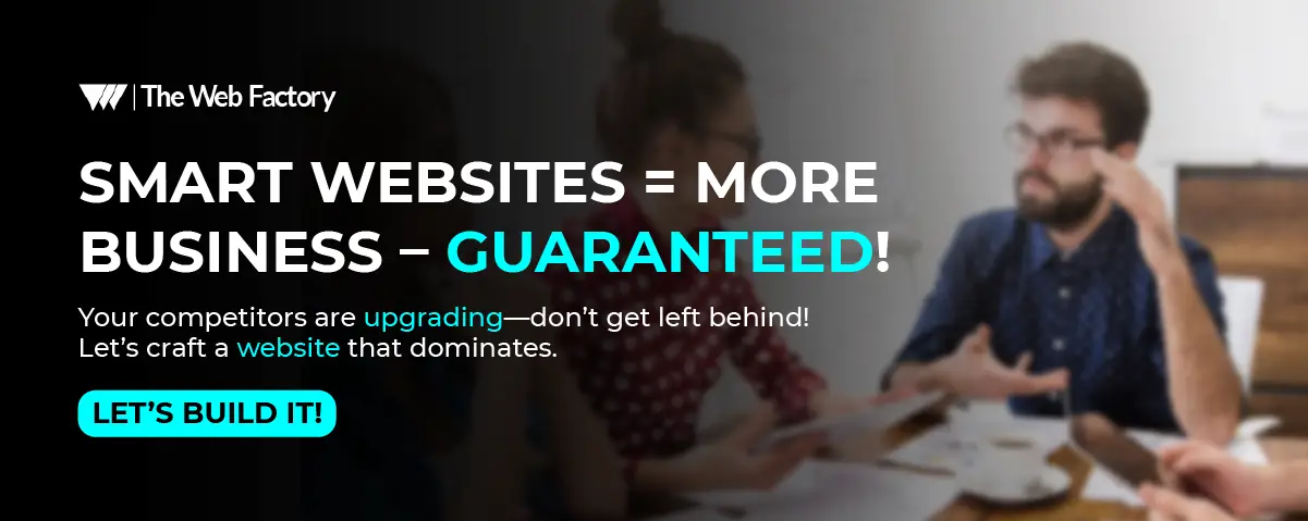
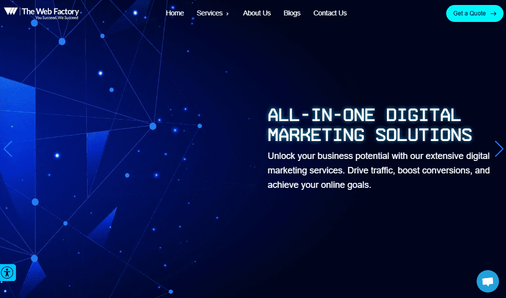
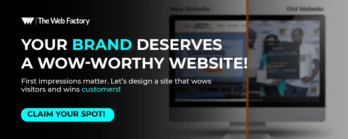
1. The Web Factory – Digital Marketing Agency
Headquarters: Carterville, Illinois
Locations: New York, Houston, Washington, DC, Dallas, Austin, Chicago, San Francisco, Illinois, Delaware
Established: 2015
Team Size: 100+
Website: The Web Design Company
Socials: Facebook | Twitter| Instagram | LinkedIn | YouTube
What Makes Them Stand Out:
The Web Factory is one of the rare digital agencies that combines design, technology, and business growth. They’re not just in the business of building websites—they’re in the business of helping brands make money online.
Their team takes a strategic-first approach, combining branding, design psychology, SEO, and development into one cohesive package. But what sets them apart? Their ability to think like marketers, not just designers, is extremely important. A good design can attract people, but only good marketing can sell.
Signature Strengths:
- High-converting designs rooted in customer psychology.
- Content-driven approach with storytelling and emotional triggers baked into the layout.
- Technical SEO baked into the build, not slapped on afterward.
- Deep experience in eCommerce, SaaS, and service-based businesses—with real case studies and numbers to back it up.
- Transparent project timelines, strong client communication, and an agile process that allows for creative flexibility.
Best For:
Founders, startups, and growing businesses who want a partner—not just a vendor. If you’re looking for a slick brochure site, this isn’t the agency for you. But if you want a site that sells, they’re your people.
Notable Projects:
- eCommerce site for a fashion brand that doubled conversion rates in 90 days
- Custom LMS design for an EdTech client in the MENA region
- Local SEO + web revamp that pushed a medical practice to page 1 for high-value keywords in under 6 months.
Verdict:
The Web Factory is a rising powerhouse. They’re especially strong for companies that want an all-in-one team that handles strategy, design, copy, SEO, and dev—without drowning you in jargon or delays.
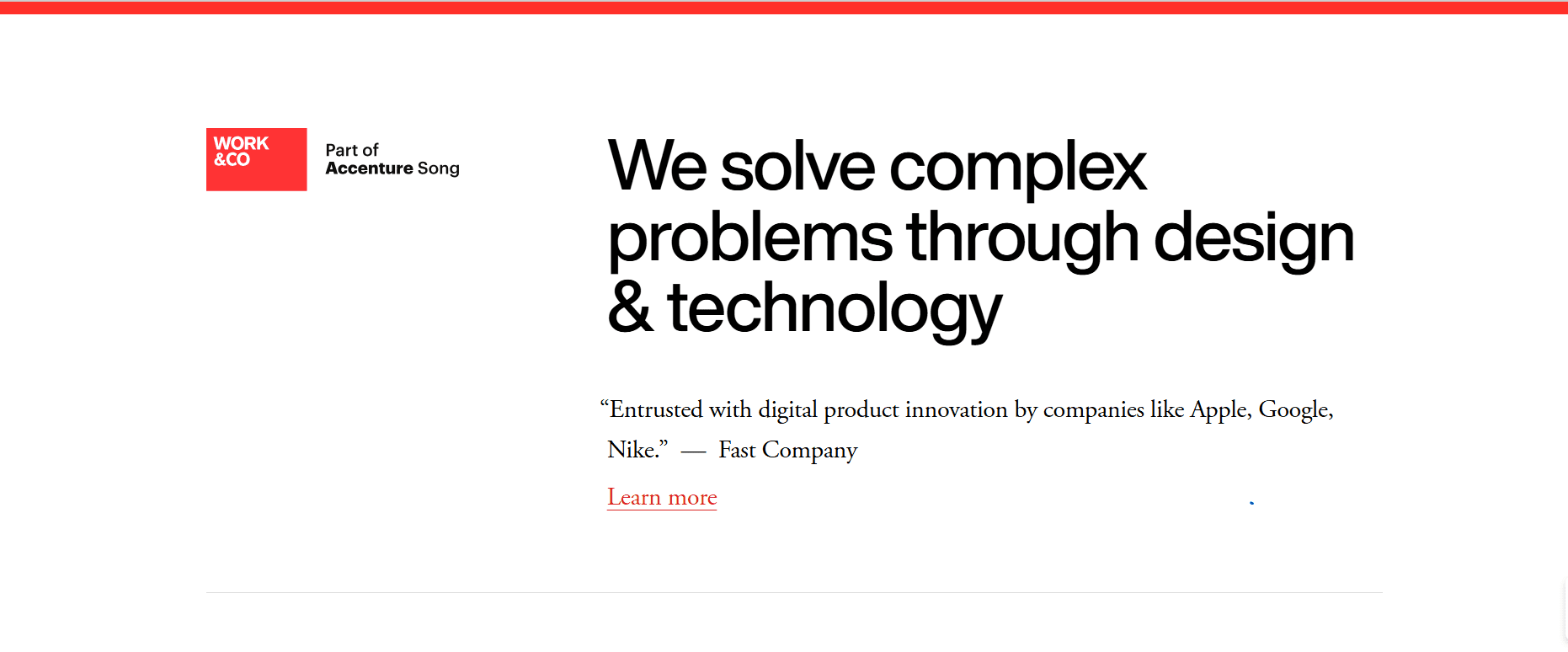
2. Work & Co
Headquarters: New York, USA (with offices in São Paulo, Copenhagen, and Los Angeles)
Established: 2015
Team Size: 150+
Website: Work & Co
Socials: Facebook | Twitter | Instagram | LinkedIn
Explore Their Work: Portfolio
What Makes Them Stand Out
They’re not just a web design agency—they’re a digital product studio that builds multi-million dollar experiences. Their clients include giants like Apple, Nike, IKEA, Mailchimp, and Major League Baseball. These aren’t branding exercises—they’re strategy-led, performance-first digital experiences.
They partner directly with brands on high-impact products. Think Nike training apps integrated with hardware, IKEA kitchen planning tools, or Gatorade’s hydration tracker —products that live on billions of devices and shape brand perception.
Signature Strengths
- Elite UX & Product Design: Every design decision is backed by prototypes, testing, and data. No guesswork.
- High-end Interactive Features: They’ve built interfaces driven by WebGL, AI, VR, and motion—often chosen for their storytelling potential more than novelty.
- Senior-Led Teams from Day One: Skip junior handoffs and bottlenecks — you work with senior planners, designers, and engineers from the start.
- Ethical, Impact-Focused Projects: From disaster relief tools to public interest campaigns, their work tends to weigh just conversions.
Best For
Mid-sized to enterprise-level brands that are ready to rethink what a website can do. If you’re building an experience, not just a brochure—Work & Co is a match. They’re not cheap, but they’re trusted by brands that need to think long term and scale globally.
Notable Projects
- A VR-enabled IKEA showroom experience that impacted in-store time and sales tracking.
- Gatorade’s Gx hydration ecosystem app — awarded Mobile App Design of the Year, 2022.
- Mailchimp’s replatform and branding refresh—a full digital overhaul backed by strategic dashboards.
Verdict
Work & Co is not for casual projects. This is next-level digital brand building. If your goal is to create a digital product that stands alongside your brand, you’ll want them on your team.
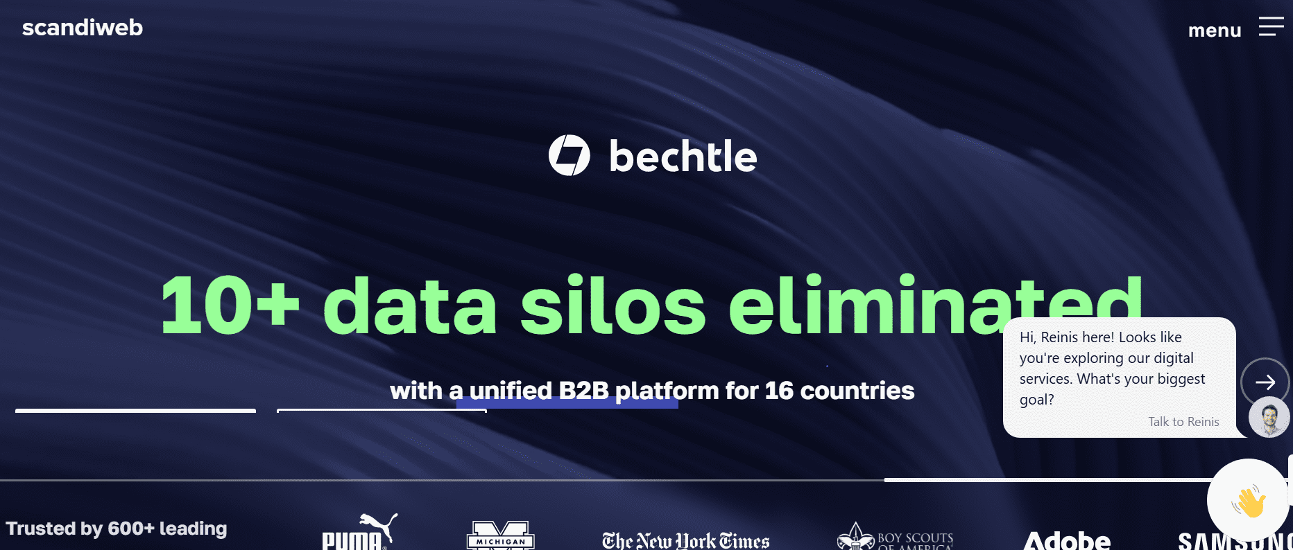
3. Scandiweb
Headquarters: Riga, Latvia
Established: 2003
Team Size: 100+
Website: Scandiweb
Socials: Facebook | Twitter| Instagram | LinkedIn | YouTube
Explore Their Work: Portfolio
What Makes Them Stand Out
Scandiweb is the go-to agency for eCommerce brands—especially those on Magento and Adobe Commerce. While many agencies dabble in e-commerce, Scandiweb specializes in it. They’ve supported everything from ambitious startups to Fortune 500 brands like Puma, Jaguar, The New York Times Store, and Walmart.
They are obsessed with performance. Every site they touch is optimized for speed, conversions, and scalability. What you get is not just a store—it’s an entire eCommerce ecosystem built to scale globally.
Signature Strengths
- Full-Service eCommerce: They handle everything—strategy, UX/UI, performance optimization, integrations, hosting, and support.
- Magento Experts: They’re widely recognized as the largest Magento agency in the world. If you’re building a Magento store, they’re top-tier.
- Conversion Rate Optimization (CRO): Their CRO frameworks are not afterthoughts—they’re baked into the design process from day one.
- 24/7 Support: Many global brands trust them with ongoing optimization and round-the-clock site support.
Best For
E-commerce brands that are scaling fast and need serious performance. If you’re tired of the patchwork fixes and want a long-term strategic partner that deeply understands eCommerce from backend to UX, Scandiweb is a serious contender.
Notable Projects
- Jaguar Land Rover: Scandiweb built an international dealer portal that syncs product updates, CRM data, and lead gen across 26 markets.
- Puma: Delivered a lightning-fast, mobile-first shopping experience with a heavy focus on conversions and cart completion.
- The New York Times Store: A global eCommerce experience aligned with one of the most trusted media brands in the world.
Verdict
If your business lives and dies by eCommerce performance—page speed, conversion rates, seamless mobile UX—Scandiweb is one of the safest, smartest bets you can make. Especially for mid-to-large retailers running on Magento or Adobe Commerce.
4. Clay
Locations: New York, San Francisco, Austin, Los Angeles, Portland, Buenos Aires, São Paulo, London, Berlin, Shanghai, Tokyo, Singapore, Batam, Sydney, Melbourne
Headquarters: San Francisco / Remote
Established: 1977
Team Size: 2500+
Website: Clay
Socials: Clutch | Instagram | LinkedIn
Explore Their Work: Portfolio
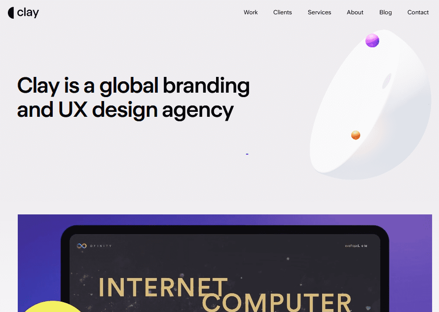
What Makes Them Stand Out
Clay is a design craft elevated to an experience. They don’t just make websites—they translate brand values into motion-heavy, narrative-driven digital experiences. For them, every scroll, hover, and transition communicates character.
They have partnered with brands like Dropbox, Stripe, and Notion. Known for pushing forward UX norms, Clay is where interactivity meets storytelling—without garbage distractions.
Signature Strengths
- Animation-first approach: Expect motion micro‑interactions, scroll-triggered storytelling, and layered 3D transitions that feel like film, not a webpage.
- Brand alignment: Clay forces your brand to behave like your identity—not the other way around. Many agencies claim to design “on-brand.” Clay lives that.
- Collaborative clarity: Their process is not messy. Figma prototypes, motion specs, and build-ready handoffs all backed by sharp client syncs.
- High-end polish, fast iteration: They work quickly—but every version feels refined, not rushed.
Best For
VC-backed startups, design-forward tech brands, and digital-first products with big visuals and bold identity. Clay expects you to care about differentiation—and they work hard to architect it into your site.
Notable Projects
- Stripe Design System: A seamless, motion-rich site used globally by customers and developers alike.
- Dropbox Brand Evolution: Focused on storytelling and product motion shifts, with a clean but highly engaging micro-animation flow.
- Notion Partner Showcase: Designed for clean brand narrative and interactive case study reveals—built to feel like flipping through a design journal.
Verdict
Clay is all about how the scroll feels. If you want your brand to be remembered—not just seen—this is your team. Their work is polished enough for enterprise, but creative enough for the startup world.
5. Lounge Lizard (USA – Creative Web & Marketing Agency)
Headquarters: New York, NY (with offices in Washington, DC, Nashville, and LA)
Established: 1998
Team Size: ~11–50 employees
Website: Lounge Lizard
Socials: Facebook | Twitter| Instagram | LinkedIn | Pinterest
Explore Their Work: Portfolio
Typical Project Range: $10K–$200K+ ([Clutch reviews benchmark][web])
Notable Clients: Disney, Canon, ESPN, Nikon, A&E Television, Andersen Tax, Dylans Candy Bar, CapterraClutch
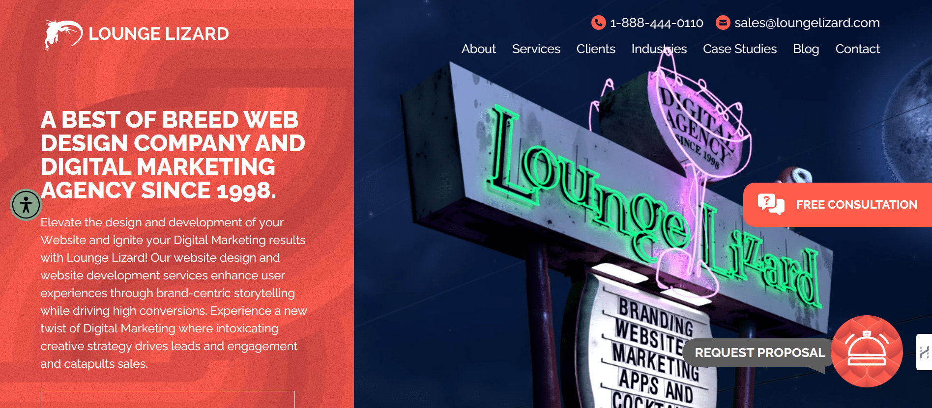
Why TheyMatter in 2025?
Lounge Lizard isn’t just another digital shop—it’s a full-service creative studio rooted in branding and storytelling. While many agencies chase flashy interfaces, they dig deeper: aligning brand identity, SEO, and UX in one relentless package.
They call their team “Brandtenders” and “Marketing Mixologists”—and it shows. Their digital work isn’t just visual. It’s strategic, conversion-focused, and scalable.
Core Strengths
- Creative-first Web Design & WordPress Mastery
They build bold, interactive websites on WordPress, Magento, and Shopify. And they’re known for turning design-first visions into functional, optimized deliverables. - Digital Marketing Built-In
Pairing design with SEO, PPC, CRO, social media, and content. The kind of blend most agencies still struggle to pull off. - Strong Client Feedback on Strategy & Execution
Reviewers consistently praise their professionalism and clarity:
“They truly understood our business goals.” — State Farm rep via Clutch.
- Reliable Project Management and Post-Launch Support
Many clients say they’re responsive even after delivery, which is rare in this industry.
Ideal For…
Mid-market to enterprise brands that value big creative ideas with real strategy. Especially those in tech, education, entertainment, or service industries where brand identity matters as much as functionality.
Notable Case Studies
- NEG Natural (eCommerce): 186% increase in organic traffic after redesign; aligned with performance and brand refresh.
- SaviLinx: Pageviews jumped 641% post-redesign thanks to improved UX and SEO optimization.
- Spectrum Retirement Communities: Saw a 31% lift in inquiry form submissions on uplifting, cleaner web flows.
Things To Keep in Mind
- Minimum Project Costs: Starts around $10K, but mid-level builds often reach $50K+. They’re ideal when branding + marketing strategy matter.
- Content Quantity Limits: Smaller team size means fewer simultaneous projects. That can impact timelines if many revisions are needed.
Final Verdict
Lounge Lizard is an excellent choice if you want a design with depth. They’re not lean, cheap, or fast—and they don’t claim to be. They’re about thoughtful, creative strategy, strong UX, and delivering brand-marketed experiences. If you want attention, not anonymity, they’re worth talking to.
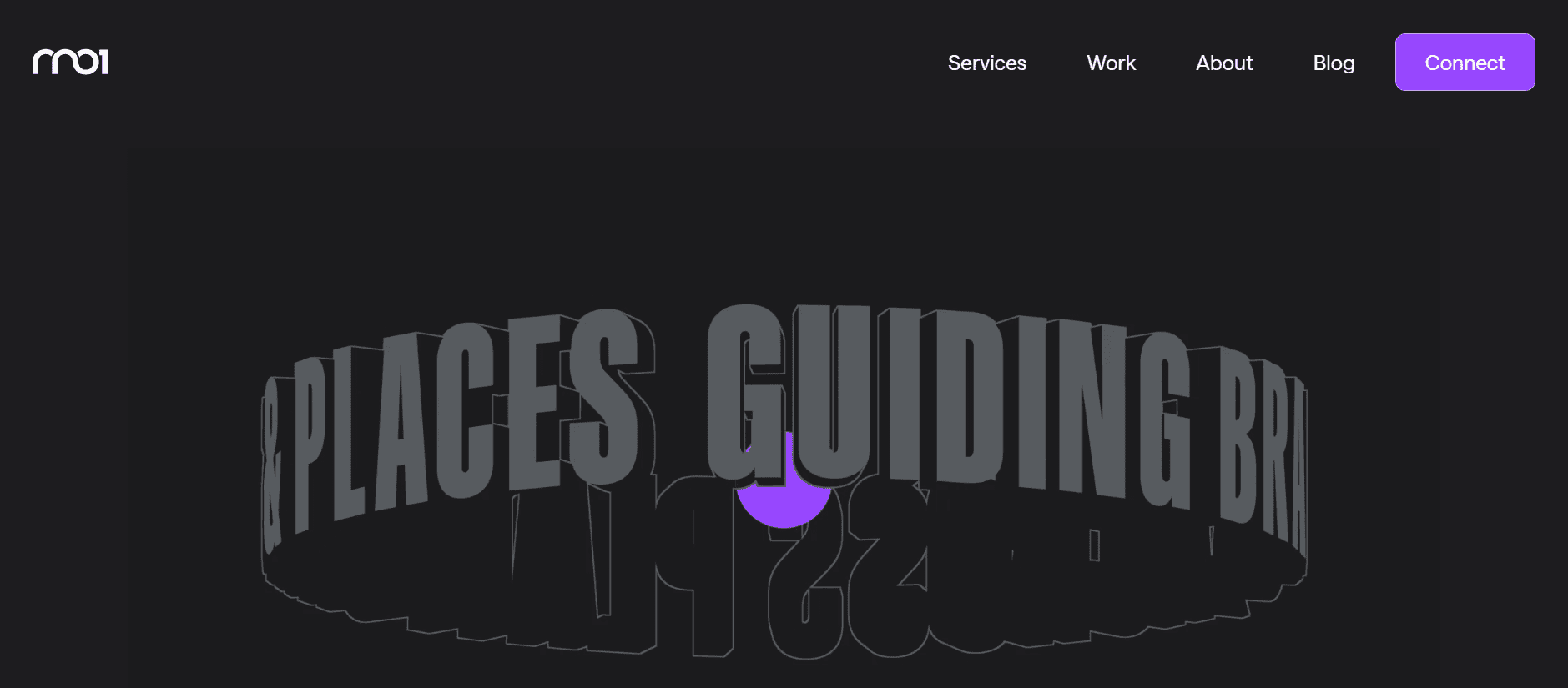
6. RNO1 – The West Coast Branding-Driven Powerhouse
Headquarters: San Francisco, CA
Established: 2010
Team Size: ~10–49 employees
Website: RNO1
Socials: Facebook | Twitter| Instagram | LinkedIn
Explore Their Work: Portfolio
Services: Web design, brand strategy, UX/UI, eCommerce, digital campaigns
Let’s talk about RNO1.
This isn’t your run-of-the-mill, “we make pretty websites” agency. RNO1 is a West Coast brand and digital experience firm that thrives at the intersection of disruption and design.
But what does that mean?
It means they don’t just build websites. They craft entire digital ecosystems. If you’re a tech startup looking to scale fast, or a bold brand trying to punch above your weight, this is the team you call.
What Makes RNO1 Different?
RNO1 doesn’t start with templates. They start with the user—your user. Every project is rooted in deep audience strategy, conversion mapping, and behavioral psychology. They work like a growth team disguised as a design agency.
They bring a Silicon Valley mindset to branding and UX—rapid testing, experimentation, and measurable design decisions.
Their focus is clear: helping digital-first companies scale smarter.
Notable Work:
- CloudApp – RNO1 reimagined their entire web experience, boosting engagement and brand equity in the hyper-competitive SaaS space.
- Platform Science – Created a sleek, modern interface for this connected vehicle startup, balancing complexity with usability.
- LOLIWARE – Helped this sustainable plastics brand look and feel like the future—clean, bold, and purpose-driven.
Why They Matter in 2025?
In a web that’s cluttered with aesthetic sameness, RNO1 is doubling down on experience-first design. They know storytelling matters, but they also know performance matters more.
They’re not just designing for clicks. They’re designing for momentum.
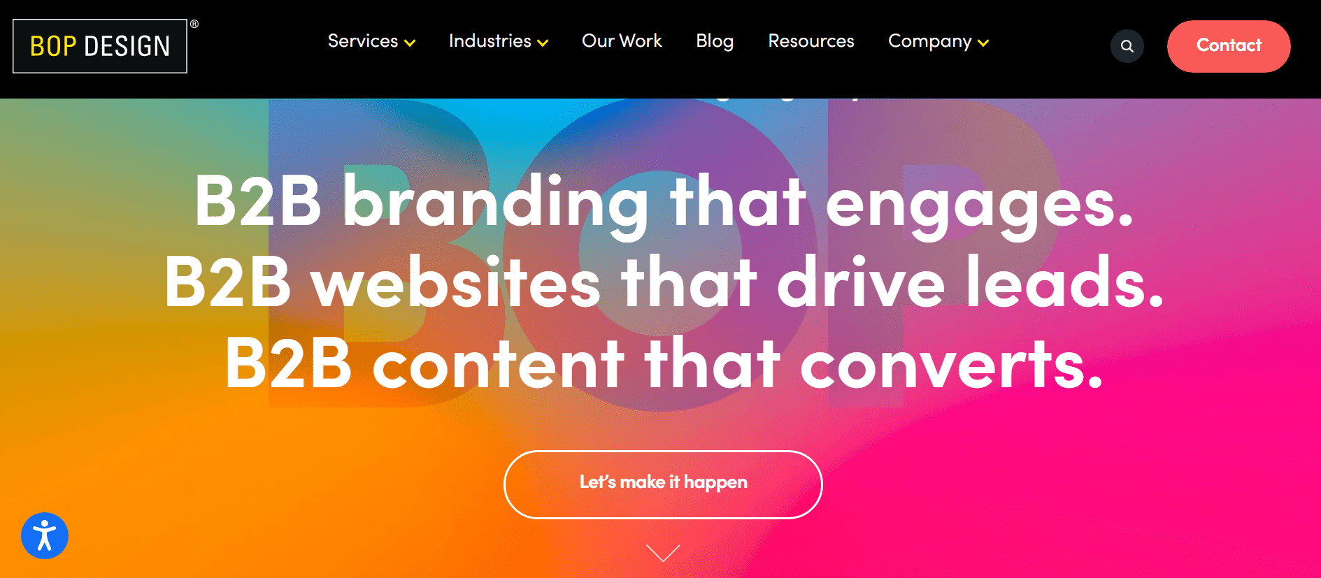
7. BOP Design – The B2B Web Agency That Actually Gets B2B
Headquarters: San Diego, California
Established: 2008
Team Size: ~10–49 employees
Website: BOP Design
Socials: Facebook | Twitter | Instagram | LinkedIn | Youtube |
Explore Their Work: Portfolio
Services: B2B Web Design, Branding, Content Marketing, UX Strategy
Let’s be honest: most web agencies do not understand B2B.
They think it’s just a duller version of B2C. Slap on a clean layout, add some jargon, throw in a CTA button—and boom, it’s done.
But B2B buyers aren’t idiots. They’re researchers. They’re skeptics. They take months to make decisions—and your website has to hold their attention at every stage of that long, messy buying cycle.
That’s where BOP Design comes in.
What Makes BOP a Killer B2B Web Partner?
This agency doesn’t try to win design awards. It tries to win trust—and trust is everything in B2B.
- They build authority-driven websites that lead with positioning, not pretty gradients.
- They know how to turn complex services into digestible, scroll-stopping narratives.
- And they get content. Like, get it. Their copy isn’t fluff—it’s persuasive, structured, and SEO-ready.
BOP Design has laser focus: they only work with B2B companies. That gives them a huge edge—they know what works, what flops, and what moves deals forward.
Their Web Design Philosophy:
- Clean and conversion-aligned: every page is built to lead buyers from problem → education → trust → action.
- SEO-integrated from day one (not tacked on after the site is built)
- Obsessive about fast loading times, mobile UX, and accessibility—no bloated templates or clunky CMS setups.
Who They have Worked With:
- Healthcare SaaS brands needing credibility fast
- Fintech and engineering firms with zero visual identity—until BOP rebuilt them from the ground up
- Tech service providers with complex offerings that now feel simple, elegant, and buyer-friendly
Why They Made It To This List?
Because B2B is hard, and BOP doesn’t treat it like an afterthought.
They’re one of the few agencies that combine strategic messaging, clean design, and conversion-first UX into one tight, focused system that gets results for B2B clients.
They don’t just build websites.
They build digital credibility.
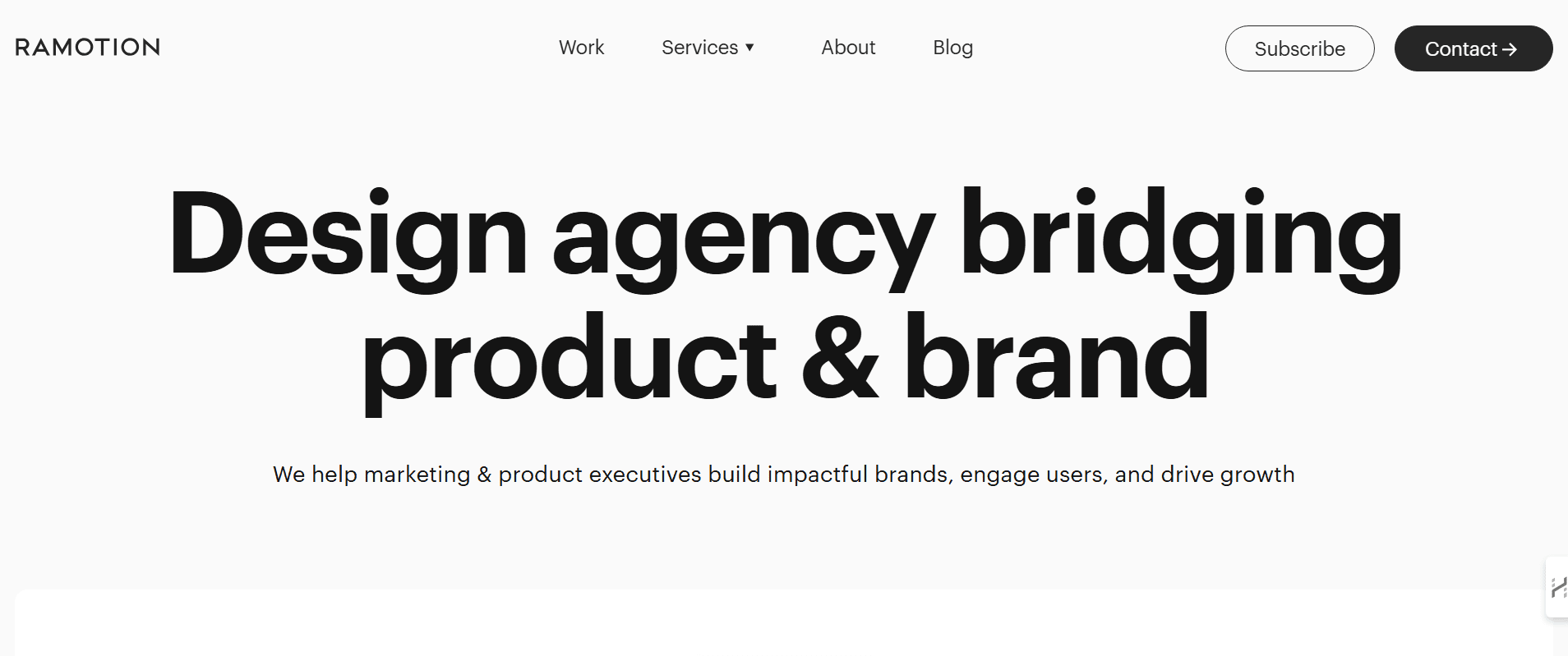
8. Ramotion – Where Design Meets Growth Strategy
Headquarters: San Francisco, California
Established: 2009
Team Size: ~10–49 employees
Website: Ramotion
Socials: Facebook | Twitter | Instagram | LinkedIn | Bēhance | Dribbble
Explore Their Work: Portfolio
Services: Web Design, Brand Identity, UI/UX Design, Front-End Dev
Let’s get one thing straight:
If you want a pixel-perfect website that also works like a growth engine, you don’t hire a generalist agency.
You call Ramotion.
These guys sit at the intersection of brand identity, user experience, and high-performance design—and they do it without bloated timelines or unnecessary flash.
Ramotion is where startups go when they’ve outgrown their cheap website—and where enterprises go when they’re tired of looking average online.
What Makes Ramotion Stand Out?
They don’t just design.
They go deep into your business model, user personas, buyer journey, and growth goals—and then reverse-engineer a site that drives those outcomes.
Here’s how that shows up in their work:
- Conversion-optimized UX that’s as strategic as it is sleek
- Lightning-fast performance—no bloat, no lag, no excuses
- Mobile-first, always—they build for a world that scrolls
- Brand consistency from web to app to product UI
Their work has a rare kind of polish—like someone cared about the little things. Typography. Spacing. Motion. Intentionality.
And it shows.
Ramotion’s Core Playbook:
- Discovery-first process: they don’t guess—they dig.
- Scalable design systems: so your brand grows with consistency.
- Tight integration with dev: the handoff from design to code doesn’t get lost in translation.
Who They’ve Worked With:
- Mozilla
- Salesforce
- Netflix
- Adobe
- and dozens of YC-backed startups scaling fast and breaking things (intelligently)
Why Ramotion is on This List:
Because they understand, they recognize that your website isn’t just a digital business card—it’s your growth platform.
And they bring the chops to build it that way.
They’re especially strong for SaaS, productized services, and fast-growing startups that need design that isn’t just “good enough.”
Ramotion delivers clarity, speed, and systems that scale.
9. Baunfire – Where Conversion Strategy Meets Modern Design
Headquarters: San Jose, California
Established: 2001
Team Size: ~10–49 employees
Website: Baunfire
Socials: Facebook | Twitter | Instagram | LinkedIn
Explore Their Work: Portfolio
Services: Web Design, Webflow/WordPress Development, Brand Strategy, Content Strategy
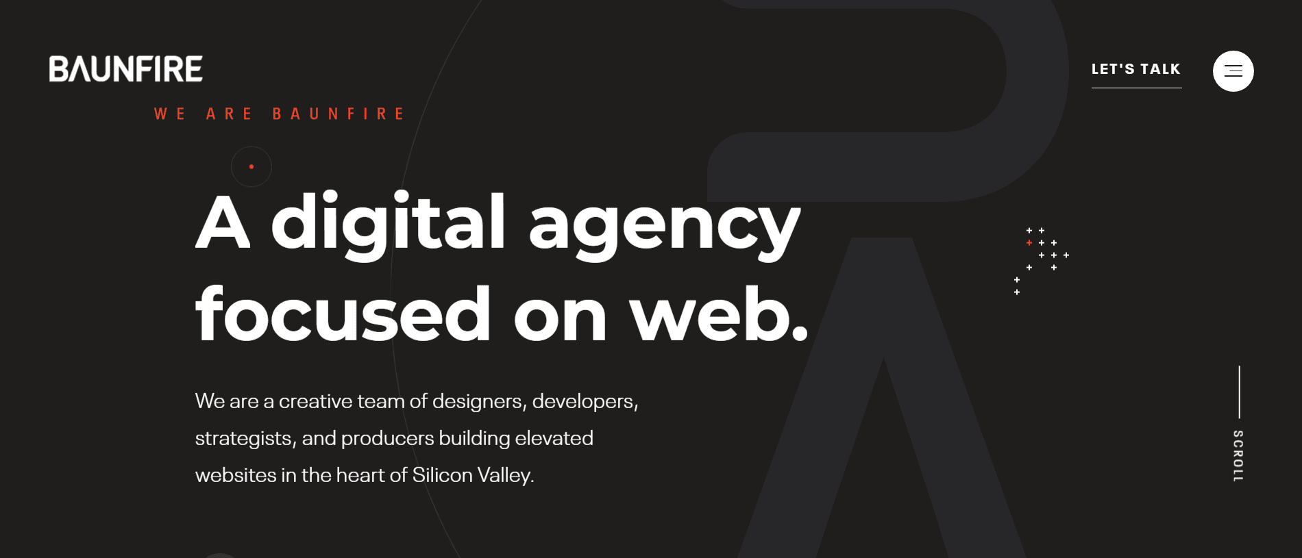
If you’re looking for a web design partner that blends high-performance aesthetics with business brains, Baunfire needs to be on your radar.
Based out of Silicon Valley, Baunfire isn’t one of those artsy agencies obsessed with “pixels for pixels’ sake.”
They’re laser-focused on how design impacts business outcomes. Every page, section, and scroll is engineered to guide users, reduce friction, and drive conversions.
This isn’t just web design. This is digital storytelling with teeth.
Why Baunfire Stands Out?
Let’s dissect what makes them different from the sea of same-sounding agencies:
1. Brand-Driven, Strategy-Backed
Baunfire kicks things off with deep discovery—understanding your audience, positioning, and goals before touching a design tool. It’s not just “what should this look like?” It’s:
“How will this site make you money?”
Their design decisions are aligned with business strategy—which means better conversions, stronger engagement, and zero fluff.
2. Data-Informed Design
They don’t rely on guesswork or trends.
Baunfire incorporates analytics, heatmaps, and user flow data to design websites that people use the way they’re supposed to.
In a world where most agencies stop at “looks nice,” Baunfire keeps going until the metrics move.
3. Pixel-Perfect Execution
Their visual style is slick, modern, and built for clarity. No bloat. No distractions. Just clean UI that gives the user exactly what they need—at the exact moment they need it.
Animations are smooth but purposeful. Layouts are dynamic but never disorienting.
It’s aesthetic meets usability—with conversion built into the bones.

Who They Work With:
Baunfire works with startups that have traction and enterprises that demand precision. Their portfolio is packed with names like:
- Google
- Nike
- Cisco
- Netgear
- NASA
- Thermo Fisher
They’re trusted by both product-driven tech companies and global brands with serious reputations to protect.
Their Sweet Spot
- B2B and SaaS web design
- Growth-focused websites for funded startups
- Rebrands for scaling companies
- Marketing sites that support inbound, ABM, and paid acquisition
If you want a site that’s more than just a digital handshake—one that supports sales, builds trust, and grows with your team—Baunfire gets it done.
10. Beyond – Strategy-Driven Design Meets Engineering Precision
Headquarters: San Francisco, London, New York
Established: 2010
Team Size: ~51–200 employees
Website: Beyond
Socials: LinkedIn
Services: UX Strategy, Product Design, Front-End Development, Emerging Tech
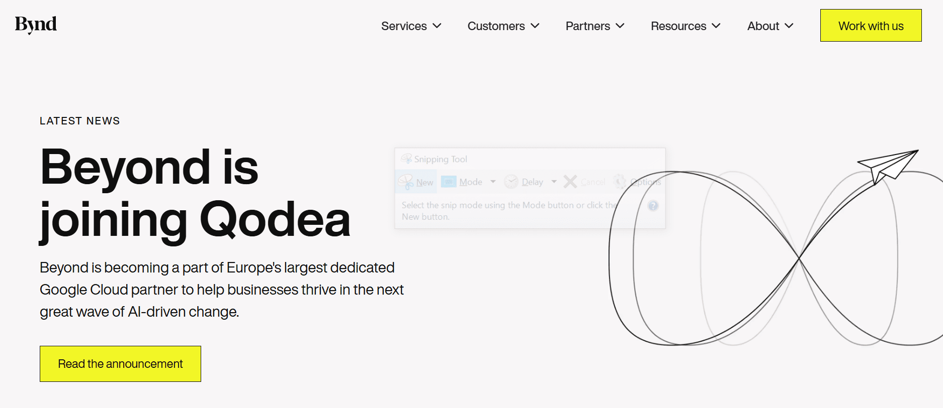
Beyond is not just a design agency—they’re a digital product studio that lives at the intersection of design, strategy, and engineering.
They’re the ones you bring in when your project can’t afford to fail.
What Makes Beyond Different?
Here’s where they shine:
- They start with the “why”: Before any wireframe gets sketched, they dig deep into customer insights, business goals, and data. No assumptions. No shortcuts.
- Design + dev in one room: Designers and engineers work shoulder-to-shoulder, not in silos. This means fewer disconnects, faster builds, and interfaces that work.
- Rapid prototyping: They don’t wait for perfect. They build fast, test early, and refine based on feedback—not ego.
- AI & emerging tech: Beyond isn’t just riding the tech wave. They’re ahead of it. They actively experiment with AI, machine learning, and voice UX in real-world products.
This is a design that’s less about looking pretty and more about building what matters.
Who They Have Helped:
- Google (yes, again. Patterns matter.)
- Facebook
- Just Eat
- Snapchat
- Warner Bros
- Snapchat
Giants trust them—but still nimble enough to adapt to startup timelines.
Perfect For:
- Enterprises building new digital products from scratch
- Startups with big ideas and no internal product team
- Companies that are modernizing legacy platforms
Beyond doesn’t give you “just a website”—they give you a blueprint for digital transformation.
11. Active Theory – Where Web Design Feels Like a Movie Scene
Headquarters: Los Angeles, CA
Established: 2012
Team Size: ~11–50 employees
Website: Active Theory
Socials: Facebook | Twitter | Instagram | LinkedIn
Explore Their Work: Portfolio
Services: Creative Development, WebGL, 3D/2D Animation, UX Design
If websites were cinema, Active Theory would be Christopher Nolan.
This studio doesn’t just design websites—they create immersive, interactive experiences that pull you in and make you forget you’re even on a browser.
Forget templates. Forget grids. This is high-concept storytelling fused with cutting-edge code.
What Sets Active Theory Apart?
- WebGL sorcery: These folks have mastered WebGL. Think 3D, think fluid animations, think real-time environments that respond to your movement. It’s not a gimmick—it’s their native language.
- Interactive storytelling: They build digital experiences that flow like a film. There’s a beginning, a climax, and an emotional beat at the end. Yes, all on a website.
- Flawless execution: It’s not just pretty for the sake of pretty. Every animation, scroll effect, and micro-interaction has purpose and polish.
Their work doesn’t feel like browsing—it feels like entering a different reality.
Who They Have Worked With:
- Google (a recurring theme…)
- Spotify
- NASA
- Adidas
- Netflix
- HBO
They build experiences people remember. And in a world where bounce rates are high and attention spans are low—that’s rare.
Perfect For:
- Brands with a strong story to tell
- Campaign launches that need to go viral
- Entertainment, fashion, or culture-first companies
- People who want to wow, not just inform
Active Theory is where brands go when they want to break the internet on purpose.
12. BKWLD – The Agency That Designs Emotion, Not Just Interfaces
Headquarters: Sacramento + Remote
Established: 2001
Team Size: ~11–50 employees
Website: BKWLD
Socials: Twitter | Instagram | LinkedIn
Explore Their Work: Portfolio
Services: Strategy, Brand Positioning, UX/UI, Web Design, Development
If your brand has depth—if it’s more than just a product or a service—BKWLD is the agency that’ll pull that soul into the screen.
They don’t just make websites. They make emotional resonance—wrapped in tight UX, layered with intuitive motion, and finished with pixel-perfect branding.
What Makes BKWLD Different?
- They lead with story: Every project begins with the why. What does your brand stand for? What do you want people to feel? Then they build the visuals around that emotion.
- Hybrid of strategy + art: These guys are both left-brain and right-brain. Creative enough to move you. Strategic enough to sell for you.
- Less is more: BKWLD’s work is clean, bold, and confident. They’re not afraid of white space or subtlety—because they know that sometimes what you don’t say hits hardest.
Who They’ve Worked With:
- Apple (yes, that Apple)
- Facebook
- Paramount Pictures
- Nike
- Netflix
- Sierra Nevada Brewing Co.
That’s not a client list. That’s a masterclass in brand diversity—and they’ve nailed it across the board.
Perfect For:
- Purpose-driven brands with bold stories
- Consumer-facing businesses ready to scale
- Companies that want to be felt, not just seen
- Teams that respect the power of design to shift perception
Conclusion: Don’t Just “Get a Website.” Build a Weapon.
Here’s the deal: In 2025, a website is not a digital brochure. It’s your brand’s most valuable sales asset.
It can attract, engage, convert, and retain. Or it can sit there collecting digital dust while your competitors eat your traffic and your revenue.
That’s why you don’t need “a guy who knows WordPress” or a trendy agency that wins awards but can’t explain what your product does.
You need a partner who understands what moves the needle—who blends branding, UX, copy, dev, and strategy into one performance engine.
The 12 companies we’ve listed here? They’re not just building websites. They’re building momentum.
And one final thought:
Before you choose, understand your market.
Study your competitors. Learn from the 27 Latest Web Development Trends & Technologies in 2025. Explore what’s working in the 55 Best Website Design Ideas. And when you’re ready to move, consider reaching out to one of the 12 Best Web Design Companies in 2025 that get it.